To understand the current equity market valuation, a good place to start is to do a quick analysis of what market value looked like at the start of the year. We can then look to separate the impact of COVID on the economy and markets. At the time of writing, the S&P is heading towards 3,000.
PE ratio
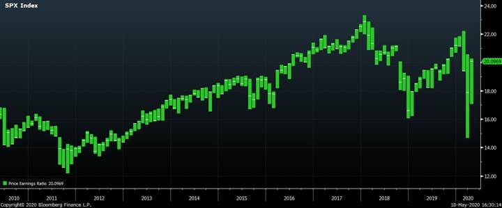
A simple and decent method of equity valuation is to look at the PE ratio overtime – price of equities divided by their annual Earnings. For the S&P, it is currently just over 20, which is roughly the middle of the range of the past 5 years. Furthermore, it looks even more reasonable when compared with fixed income where bond yields are close to nothing.
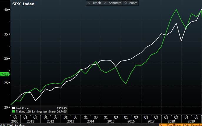
Over the same period the stock market has risen strongly. In the chart below, I show that the value of the S&P has doubled in the last decade, as have quarterly earnings (S&P EPS)
Where does earnings growth come from?
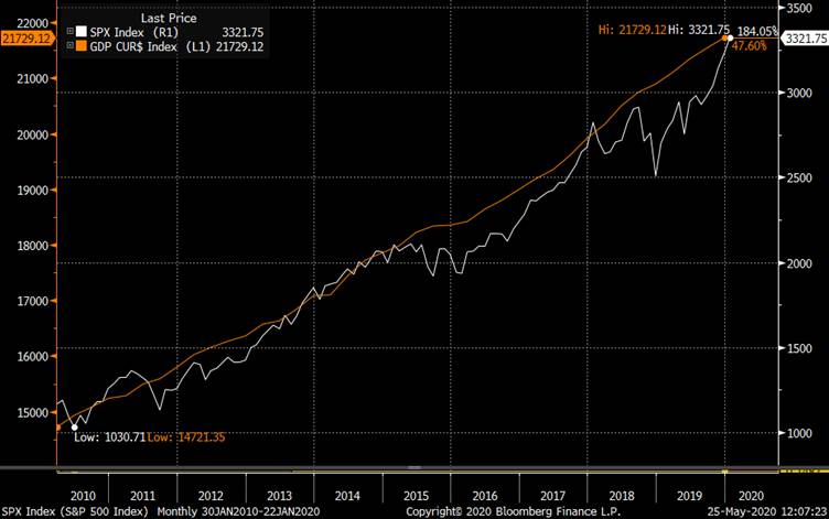
The answer is of course that companies are part of the economy and as the economy grows then corporate earnings also grow. In the chart below, we see uninterrupted US GDP growth for the past 10 years and also a rising S&P based upon growing earnings.
This must all be consistent then?
This simple look at equities implies that the rapid rise in equities over the past decade has been fully justified by the fundamentals in the economy.
But I played a little trick in the charts above.
While the stock market, GDP and corporate earnings have all gone up over the past 10 years they have not gone up by the same amount.
- Nominal GDP has risen by 50%
- Corporate earnings have doubled
- The US stock market has tripled
The part I want to look at more closely is the difference between GDP growth and the far more rapid growth in corporate earnings.
Any Reasons to be cautious?
It is remarkable to have such a large rise in earnings when compared to the overall economy and one would expect to see profits as a share of GDP to have risen significantly over the same period. With decent overall growth, then you might expect growth in profits to be better, and to offset this the share of the economy going to workers would be reduced. This would fit the idea that while growth has been good, more of the benefits go to the capital and capital owners and less to workers; in this recovery a lack of real wage growth is often cited as a concern in the face of rising equity prices.
When I look at the data however, it does not fit this intuition. This is a chart of corporate profits as a share of GDP over the past 60 years. 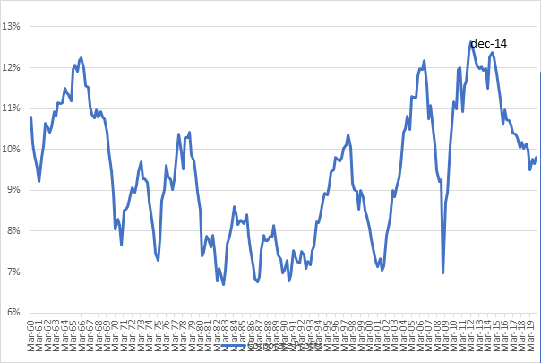
We can see it strongly mean-reverting and so the recent pattern is exactly what we would expect to see. In a recession wages are sticky and do not readily fall; it is companies that have profitability issues. We all know that companies go bust in recessions and in 2001 profits fell to 7% of GDP. In the early stages of a recovery, it is profits which rebound the fastest, wages remain subdued as there is still high unemployment so the gains from GDP growth go to businesses, and by 2014 profits as a share of GDP had nearly doubled to 12%. But later in the cycle this reverses, and profit margins are squeezed, which they have been for the past 5 years.
This does not make sense!
I have just told you two contradictory stories. One is that corporate earnings have been rising rapidly over the past few years, far faster than GDP growth. The other is that profits as a share of GDP have been falling as we would expect late in the economic cycle.
The reason I can tell you two completely different stories is that I have two different data sources. The first is the earnings (S&P EPS) as they are reported by companies. The second is profits as they are recorded in the income method GDP data – known as the NIPA data (National Income and Product Accounts).
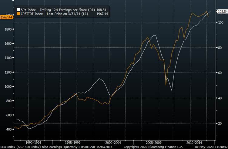
These two ways of measuring earnings are not exactly the same. For example, the S+P is only 500 companies whereas NIPA represents the entire US corporate sector. There are also differences in accounting and tax. But logically they are highly similar, and it is no surprise that historically they track very well. Here is a chart from the late 80s until 2014 showing the rise in earnings (EPS) as measured by companies and as measured by the National Accounts. We can see that in the long run, they track pretty well but there are some periods of divergence for instance around the time of the dot com boom in the late 90s.
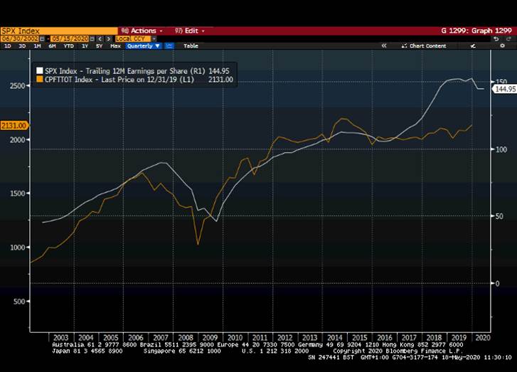
If I draw the more recent history, we can again see this divergence. The reported earnings have been rising rapidly (white line) while the NIPA measure of profits has been stagnating (orange line).
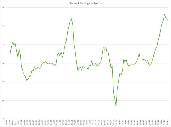
The relationship is easier to see if we take them as a ratio. In the chart below we see a large spike around the Dot Com bubble (EPS growing more than NIPA), a large spike down during the Great Recession (the opposite) and another large spike higher recently.
These differences are so large that they require an explanation.
- Dot Com spike
A bubble emerged in the late 90s with very high PE ratios i.e. companies were expensive compared to earnings. In addition, these reported earnings were inflated; a famous example you may recall was Enron who were highly “creative” with how they recorded and reported their earnings. When the bubble bursts and we move into recession then these accounting methods are not sustainable, and we see the rapid fall in reported earnings and the ratio of reported earnings to NIPA data renormalizes.
There is a danger in that earnings are presented to us by corporates in the most flattering version they can create. In a bull market, there are opportunities to keep presenting this managed version, perhaps similar to how people curate their Instagram feed. Through heavy use of filters and selective framing, someone might look as though they are very attractive with an opulent lifestyle. The recession is the equivalent of when you meet them in person and realise that the reality is not exactly what was promised.
- Great Recession
This rapid fall in reported earnings is easily explained as a result of huge write-downs taken by financial firms. This is a good example of an item that is recorded by companies as a change in earning, but not included in GDP data. Once the write-downs have finished, the ratio between reported earnings and NIPA profits renormalizes.
- Now
I have been searching for a good explanation of this divergence and am yet to find one. One plausible idea is stock buybacks, but this is not true as they are adjusted for in the earnings data. Other sources of divergence such as tax are real but do not come close to explaining the large difference.
Could the NIPA data be wrong?
This is data that will get revised, but it would take something extraordinary for GDP revisions to change corporate profits by the 40% divergence we have seen to EPS
Could it be financial accounting manipulation?
Some argue the rules are so much stricter now, so it is not possible. Surely what we learned from the last crisis is that Rating Agencies having strict rules on how to make a security AAA that enabled smart bankers to arbitrage those rules. I do not believe we could ever have rules so strict that smart bankers cannot find ways to optimise them. This does not mean that people must be lying or breaking the law. Bear in mind virtually everything that Enron did to inflate their earnings was legal.
Could it be offshoring profits?
There could be something here and it is a very murky and complex area. We know that the large tech companies have found ways to limit their onshore earnings, keeping profits in countries where they have to pay no tax but this is hardly a new phenomenon. It is something I will be looking into as an explanation.
Could it just not be a problem?
Maybe this is the first time we have ever seen a large, rapid, permanent shift in the relationship between reported earnings and NIPA data. Maybe. Most people in effect seem to be assuming this and financial markets are not at all concerned.
What if the NIPA data is right?
If the NIPA data is correct, then the PE ratio is currently far higher than 20. In the previous two cycles it was reported earnings that correct, not the NIPA data, and the timing of the correction is during a recession. As Warren Buffet said “You only find out who is swimming naked when the tide goes out”.
Summary
My view of value before COVID was that it was reasonable to belong to equity markets early in 2020. I was aware of the NIPA data divergence as an issue, but it has been an issue for a long time and it has not been a market driver. The trend towards higher earnings and higher equity prices had been very strong and I believed that it would take an event or catalyst to reverse it. If we are heading into a significant recession, then this may be the time we understand if the relationship between reported earnings and GDP profits will reconnect.

Does the market-cap weighted mechanism of the S&P500 contribute to the difference in index earnings growth relative to NIPA earnings? My guess is that the index earnings growth is a somewhat apples-to-oranges metric, taking earnings of the basket at time T vs earnings of the basket at time T-1, so the change in composition of the basket is one source of change. You could get a large change even if earnings for each constituent company were unchanged.
Aside from international profits, one popular meme that would contribute to S&P earnings growing faster than total corporate earnings is “winner-takes-all.” There’s a claim that dominant companies are squeezing out other players in two ways: within an industry category, the top firms win (say Amazon vs other retailers) and also some industries are eliminating other industries (I guess tech vs old form media would be an example). These would suggest that the S&P 500 index is a filtered sample biased to companies with faster than average profit growth.
From an accounting perspective, I wonder if there is a big difference in the way that large loss-making companies are treated for the two measures, for example Uber (though I know it isn’t in the S&P 500)?
LikeLike