I have started a substack under the same name as this blog – Applied Macro. The link to the substack is here – Applied Macro | Colm O’Shea | Substack.
You can also find this link on the home page of this blog by clicking the ‘Substack’ button in the top right
I will be posting new material on substack and will no longer be posting on this blog.
Below is a copy of my new post, the introduction to a new series exploring whether we are currently in a stock market bubble. The follow-up pieces can be found on substack.
The 2026 Stock Market Bubble
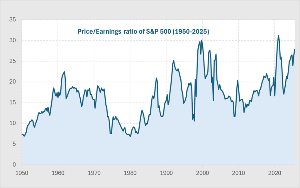
The US stock market sits at levels that look extreme by any historical comparison. These extraordinary times require a more rigorous analysis than just high Price-Earnings (PE) ratios or anecdotes about AI company valuations.
If you have investments, such as a pension, 401(k) or an ISA, you need to make decisions about how you allocate your assets. Whether or not OpenAI is worth $840bn is not relevant to you, it is a private company. What matters to you is whether the broad public market is cheap, fair value or expensive.
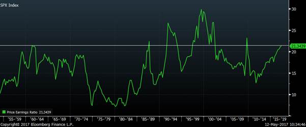
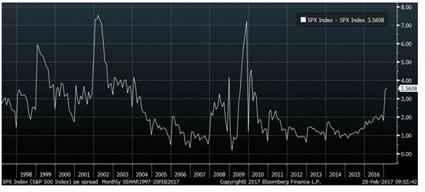
Today’s elevated PE ratio in the S&P generates a lot of press attention, but it simply reflects strong optimism about future earnings. That alone cannot tell us whether we’re in a bubble like dot-com in 2000 or on the early stage of AI driven earnings revolution.
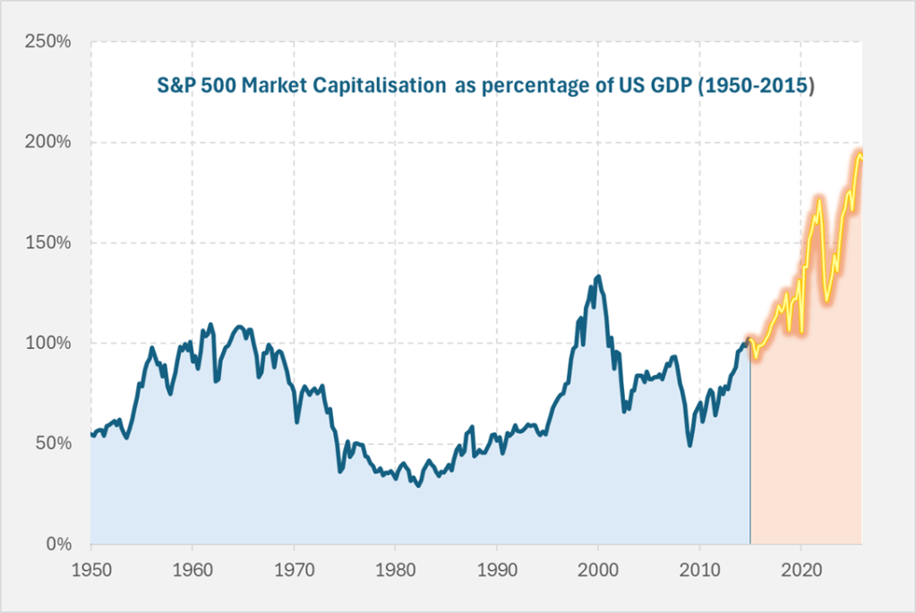
The US stock market has become enormous relative to the size of the economy. Below we show the value of US equities as a share of overall GDP. It is double what it was a decade ago, and far higher than we saw in the dot-com bubble of 2000.
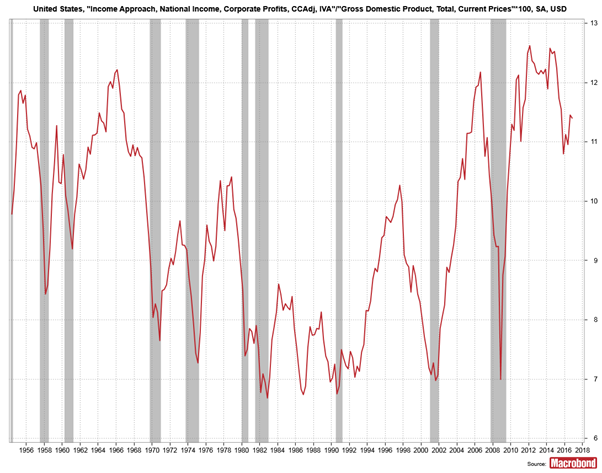
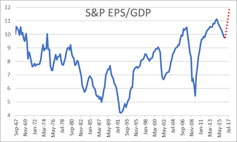
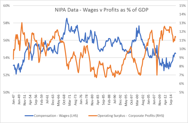
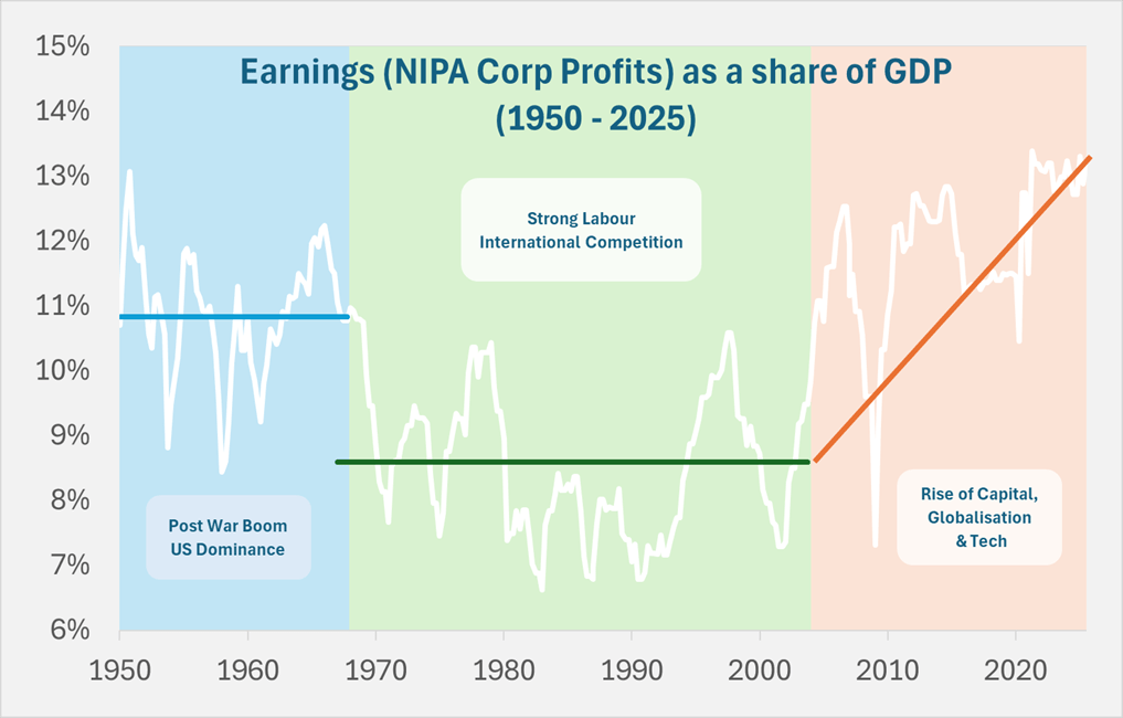
The reason this chart looks more extreme than the simple PE chart is that underlying earnings as a share of GDP has already reached unprecedented levels over the past twenty years. This rise in corporate profits from around 8.5% to 13% of GDP has seen wages stagnate, widening economic inequality, and a political backdrop marked by discontent and populist movements such as MAGA.
Current valuations show the same level of optimism about future earnings growth as in 2000 dot-com bubble, except today’s level of earnings are far higher. It is this combination that is so extreme.
What would this earnings share need to be over the next decade for your stock market investment to simply keep pace with GDP growth? The chart below shows

The projections are stark.
Current valuations assume future jumps in profitability that dwarf anything ever seen. Can AI really deliver a surge in corporate profits far beyond the gains achieved in the last waves of globalisation or past technological booms?
This series will continue on substack and examines the extraordinary claims behind these extraordinary times.
Subscribe here – Applied Macro | Colm O’Shea | Substack