Trussonomics

I am confused by the calm coverage of the recent radical shift in economic policy – described by the BBC as “bid to boost growth”.  This type of reporting does not make clear whether we are talking short-term growth or long-term potential, and how these policies impact each of them in very different ways.  From conversations with friends, much of the analysis does not investigate this and ultimately reveal just how dangerous and radical this new set of policies is. 


Potential Output – what is it?

Truss has justified her policy changes economically citing improvements in the UK’s long-term growth potential i.e. increasing potential output

Potential output is the starting point for thinking about how much the country can produce ie it is the maximum sustainable level of output. 

If we are below, then this is called a negative output gap and we see things like unemployment rates being high and inflation likely falling. 

The OBR does a great job on this and their website is very clear

Potential Output – how can we improve it?

Everyone wants to improve potential output and there is a clear left vs right divide on how best to achieve it.

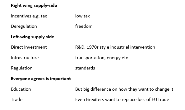
Truss is firmly in the right-wing supply-side movement of “trickle-down” i.e. give tax breaks to rich people and everyone will be better off because somehow this leads to greater potential output.  Reagan was the most prominent exponent of this view but we are still waiting for any evidence that it works.

Potential Output – will it work?

I think best to simply summarise that there is no evidence that cutting taxes has any positive effect on potential output.

OK – so if Trussonomics does not improve potential output, what does it do?

It does a LOT

The most obvious and direct impact is of course on inequality.  She is delivering a massive cash handout to rich people.  The richer you are the more you get. 

The part that is getting less attention is the impact on

  1. Fiscal vs interest rate policy mix
  2. Debt sustainability
  1. Fiscal vs interest rate policy mix

This policy choice has been perhaps at the heart of the political battle of the past decades and is commonly misunderstood.  This is a shame as a simple quadrant model does a good job of providing a framework to compare the options clearly. (Fiscal policy is the mix of tax and spending with high spending/low tax being loose fiscal policy)

Tight fiscal -tight monetary         When you are committed to fighting inflation above other policy goals.  For example, the 1980s or commonly after an economic crisis when trying to rebuild confidence in the currency and debt.  If used inappropriately looking at the 1930s Great Depression.

Tight fiscal – loose monetary     This is the Cameron years.  There is of course a debate over how tight fiscal policy should have been and on how the mix of tax and spending was managed.  But it is a consistent policy mix

Loose fiscal – loose monetary    This was at its maximum during the pandemic i.e. for a short term huge negative shock.  If used long term it just leads to economic catastrophe.

Where are we now?

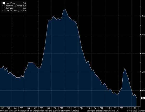
We are currently in the loose/loose box.  Taking the unemployment rate as a simple measure of the output gap, you can see from the chart below we are at record lows.  This is also clear to anyone trying to hire at the moment and all the reports of staff shortages.  Which makes it odd that Truss talks about “boosting growth” as there is no prospect of lower unemployment from here.

UK Unemployment at record lows

The other factor that makes going for growth an odd policy goal is that inflation is high and rising.  This does not have an easy solution and economic pain is unavoidable.  Trying to avoid it, leads to even greater pain later.

UK Inflation at 30-year highs

What happens next?

The Bank of England will be forced to raise interest rates by huge amounts.  At the start of this year the market expected interest rates to stay at around 1% though 2022 and 2023.  Now the market expects rates to be 4% by the end of this year and 5.5% by the end of next year- with rate expectations for next year shifting 3% since the start of August. 

What does this mean for people?

Well rich people have had a large tax cut and will be fine – I know you are all relieved to hear this.

Anyone on a regular income has had a small tax cut but this will be dwarfed by the rise in the mortgage payments coming soon.


What does it mean for the economy?

I predict a very bumpy path and hard landing for the economy but difficult to say when.  The policy mix of vast fiscal expansion at a time of low unemployment and high inflation to be offset by rapid interest rate rises is a chaotic mix.  I think the economy will stay strong and then crash hard. 

  1. Debt sustainability

This is getting some attention but is being dismissed by Truss.  The fact that they did not let the OBR produce a forecast tells us a lot about how they have contempt for this constraint on policy.  An Office of Budget Responsibility is not what the Chancellor wants to hear from!

But the bond market still exists, and long-term government borrowing is getting hammered.  30-year Gilt yields have risen from under 1% at the start of the year to 4% as I write this.

The tax cuts and extra spending increases the budget deficit.  The rise in interest rates increased the cost of servicing the debt, further increasing the budget deficit.  This can become an exponentially explosive mix with the major accelerator being a currency crisis as the value of sterling falls.

Conclusion

The Trussonomics experiment is radical and dangerous.  I expect high inflation, high interest rates and a weak currency leading to economic crisis.  Politically I expect her to start to blame the Bank of England as though the rise in interest rates was not a direct result of her policies.  The Bank of England may be independent of the government, but they are not independent of economic reality.

Truss has spoken of her disdain for “abacus economics” and she does not believe things need to add up.  I think economic reality exists and her magical money tree fantasy will fail. 

What is the Mortality Rate? Update 2

Given the recently announced antibody tests from NY, I wanted to take a closer look at my model and compare the results.  It is important to be cautious about overinterpreting preliminary results like this; it is using a new test, for a new disease, on a sample for which we do not know how well it represents the population, but it is also the best test we have so far.

In my simple model for daily death, there are 2 inputs: speed of transmission, R0, and mortality rate.  Given that we only know the output, we cannot fully determine the value of both inputs, however to fit the empirical evidence it must be that if the mortality rate is lower then the speed of transmission must be higher and vice versa.  In other words, each mortality rate has an associated path of transmission and thus a path which determines the total number of infections/deaths.

The model can tell us which combinations of transmission and mortality are possible but not what either of them is.  To do that we need to look at other data.  In my first post on mortality, I focused on studies that estimated mortality rate directly, from which we then estimate the transmission rate.  The other approach is to focus on the number of infections to give a rate of transmission and then see what that implies for mortality rate.

When looking directly at studies on mortality, I concluded that 1% was my best estimate.  The New York test is the other approach, looking at the number of infections.  We can now look at what a completely different data set tells us.  I have drawn 3 paths for NY infections below, all of which can fit the basic data we have seen on death rates.

Picture 1

There is clearly a non-linear relationship between % mortality and % infections in the population.  If I take 1% as the base case, then a rate of 0.5% would require a far higher infection rate while a rate of 1.5% instead would not change the number of infected people nearly as much.

My model predicts a mortality rate of 1% and current deaths data, then the population infection rate would be 12% of the NY State population.  This is remarkably close to the estimate from the NY test result of just under 14%.

The NY test could imply mortality rate a little below 1%, but on the other hand we know there is material underreporting of COVID deaths and so, one could equally argue that the mortality rate is a little over 1%, consistent with the same data.  Some media outlets are using the results to suggest the mortality rate is 0.5%, a poor estimate and a bad way to use statistics.  This ignores the important lag between infections and death as well as the underreporting of deaths.

My initial estimate of the mortality rate was around 1% which is confirmed by this test.  This makes all the projections for future waves of infection more likely to be ones we should be confident about.

Is this a surprise?

To me, no.  It is very much in the range of where medical expert consensus had it beforehand.  I do not think I have been proposing a model any different from mainstream medical thought, but I have found it useful to be able to make my own projections and explain the implications.

However, looking at media reports and my Bloomberg inbox, I have only read people saying that this data shows that the mortality rate is lower than expected. Some are very excitedly saying is a “game changer” and “most of our clients think this is a potentially important development”.  If this reaction is common, then it shows that while the news is virtually only about COVID, very little of it is genuinely informative and people’s understanding of the data is extremely poor.

One of the persistent misrepresentations of the data is that the reported case fatality rate is an estimate.  It is not.  It is a statistic.  It is simply confirmed deaths divided by confirmed cases.  Given the low levels of testing, we know that reported cases are a small fraction of actual infections.  Hence it may be used as an estimate, but it is a truly terrible estimate if you simply take the headline number.  Did anyone really think that mortality was “estimated” to be 13% in the UK for people who got infected?   Only if you thought this was an estimate would this “new” estimate of 1% seem lower to you.

Policy implications

The debate on deaths vs economic costs of reopening will continue, but I hope that so many pseudo-experts will now refrain from saying that COVID has a mortality rate close to flu.

Using the estimate of mortality rate from the NY data to imply infection rates in other countries, suggests that herd immunity is a very long way off.  The UK would have infection levels of just 4%.

PS Treatment news

Yesterday the S&P dropped 1.5% on news that Gilead’s drug which they touted as a treatment for COVID-19 had failed its first clinical trial.  It was a major positive news story a week ago, which tells us how people struggle to interpret news and statistics and the media struggles to provide sensible coverage.  As I mentioned on April 20th It is overwhelmingly likely that it is not trueUntil we have some proper testing, I will assume this is a nonsense story”

Similarly, please do not inject or drink disinfectant.  Killing a virus outside your body is not the same as killing it inside your body.  On the bright side, this was a Trump theory that was so bad even Fox News has not been pushing it.

What is the mortality rate? Quick data update

This data point seemed important to me and worth a short immediate note.   We have just had released the reasonably sized antibody test from an area of high infection.

The rate of infection in New York is estimated to be 14%.

This implies around 2.7m people in NY State have had the virus.

A little over 20,000 are reported to have died from COVID.

This gives a mortality rate of 0.8%

We know that the number of deaths is likely to be underestimated due to people dying at home or never being tested, so the actual mortality rate would be higher than this.

Perhaps 1% is still the best estimate.

This data confirms the studies from around the world and means that the models we have been working with look to have the correct parameters.  It makes the idea that the mortality rate is far lower even more implausible.

Are we past the peak?

As the world heads towards easing of lockdowns, it is a good time to look again at the data.  The tone I read in most media outlets, and certainly from the markets, is that the peak has passed and we will soon be able to return to something like normality.  When I look at the data however, I struggle to reach the same conclusion.

One key metric is the pace of decline in daily deaths in countries/states which have been pursuing similarly strict lockdowns. Many of these have already eased some restrictions, or are actively planning to do so over the next few weeks.

If we turn the data into an % index series to adjust for different sizes of area/population and level of infection, we see a similar picture of slow declines.

peak

Data notes:  Source is Bloomberg. I have taken a 3-day moving average as daily data is very noisy in some countries.  I have smoothed the mid-April spike in NY, due to major changes in data collection.  I have also lagged the UK data by a week, as we imposed lockdown later.

Whilst we are past the peak of this wave of infection, it has taken extreme personal and economic restrictions to bring the virus transmission rate to an R0 marginally below 1.

Recent data from New York has been more encouraging, also tallying with information from the UK government that London data is improving more rapidly with some areas of the UK still getting worse.  Last night, Chris Whitty, Chief Medical Officer for England, explained that we still do not know which lockdown measures really matter for slowing infection rates.  This makes it very hard to partially ease restrictions with confidence.

The situation in the US overall looks are even more concerning.  Here I exclude New York and New Jersey as their very high rates overwhelm the picture elsewhere.

At best, we could argue that we are at peak and that rates will decline from here, but it is premature to have much confidence in that. Yet the US is already materially reopening some States and is under pressure from Trump to open even more very rapidly.

If we look at state level data, most tell a similar story of stabilisation at best. Given the lags, we may see rates decline soon but we should then expect a rapid re-acceleration 3 weeks after lockdowns are relaxed.  The absolute numbers are still low in most states, with only a small proportion of people being infected.  This is perhaps why it is still possible to think that the problems are small and politicians can attempt to say they are under control.  But we have seen over and over again, how with exponential growth we rapidly move from 50 deaths a day to 1,000 deaths a day

Not all US states are even as good as this; despite the “stay at home order”, we are still seeing an escalating problem.

Conclusion

The evidence suggests that in areas that enacted strict lockdowns, we are indeed past the first peak.  However, lockdowns have not necessarily been as effective as hoped in rapidly bringing down infection rates.  Outside worst hit areas, compliance may be far poorer.

An early relaxation of the current restrictions will mean limited respite for health services, and if infection rates rise again they will do so from an already elevated level.  By the time we know the impact of policy changes, it will be too late to stop the next peak from being far higher than the last.