The misuse of Correlation part 5 – Hedging and Portfolio Management

For macro trading, thinking about how one asset moves versus another is important.
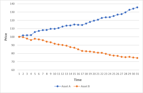
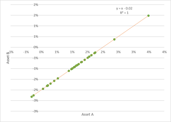
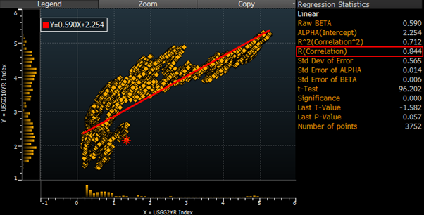
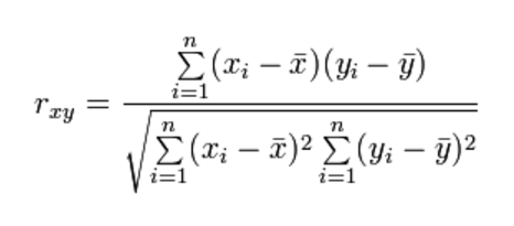
To this end, correlation is most commonly calculated using daily changes. The results of a reasonable relationship might look something like this:

Hedging

This concept is particularly useful if you are a market maker, or anyone in need of a reasonable short-term hedge for your risk. However, if you are holding for a longer period, the potential difference in the trends (the means that we touched on in part 1) are likely to dominate your returns, irrespective of the correlations.


Portfolio Risk

For constructing portfolios, measures like VaR (Value at Risk) are often used to explain and think about risks. The inputs to these measures usually take daily returns.

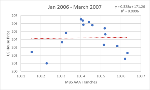
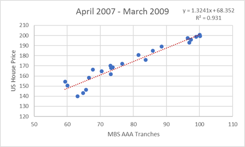
This can lead to problems with serious consequences if you are using this analysis to understand the risk of a portfolio you are planning to hold for a longer period.

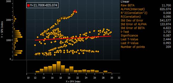
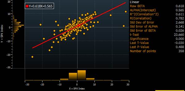
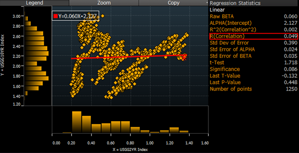
In this chart, I take a selection of major markets that a typical macro portfolio may contain: major currency pairs, interest rates and the S&P.
I plot the correlations of the pairs calculated two ways:

  • Return Correlation up the X axis
    Taking daily changes as we did previously
  • Price Correlation up the Y axis
    Looks at the correlation of the levels of each price series
    (i.e. if both assets went up over the year, implies high positive correlation)

The results are important for the construction of a longer-term macro portfolio. Take 2yr US rates and USDJPY as an example:

  1. Daily return correlation is decent around 50%
    If you are long USDJPY and you add an opposite US Rates position,
    Overall portfolio reported risk would therefore decrease

If you hold the portfolio for one day it is reasonable to expect that your hedge will act to reduce the volatility of your returns.

  1. Price correlation is actually negative

As above your reported risk is determined by the daily return correlation and decreases.

But if you took the supposedly offsetting position above, at the end of year If you lost money on USDJPY, you would have lost on your “hedge” too
The “hedge” would have reduced your reported risk but increased your return volatility on a one-year horizon.

So what does a “good hedge” look like?

Two plausible but very different definitions seem clear:

  1. High correlation of daily changes
    Consistent with VaR and best hedge for VAR, short term traders, market makers, options traders (delta hedging). A lot of option hedging is done via proxies and this is the type of statistic they would care about.
  1. Long term hedge
    Much more important for longer term position such as a macro hedge fund, a pension fund or your personal portfolio. There a hedge would mean that if you hold both assets for a year they would have similar (offsetting) P+Ls

The above analysis shows how different these two time horizons can be. The big risk we face as portfolio managers, is that we do too much of the analysis based on short term price changes, which links conveniently to VAR style risk reporting. This gives a completely misleading guide on the long term P+L risk we are actually taking.

Conclusion

In these pieces, we have seen that Correlation is probably not what you thought it was.
Correlations are used in risk reporting (as we have mentioned here) but also in Portfolio Theory, CAPM and how an investor should think of designing a portfolio.

This topic has important ramifications for many areas of modern finance and I will return to it later.

The Misuse of Correlation Part 4

Continuing from the previous post, I’m looking at issues and common mistakes arising from the use of the word correlation.

  1. Uncorrelated does not mean unrelated
  2. Correlation does not imply causation
  3. Correlation is not transitive
  4. Data issues

We have covered number 1 and 2 already.

  1. Correlation is not transitive.

In my post on significance, we covered that only some relationships are transitive.
For example, weight is a simple example of a transitive relationship

  • If Adam weighs more than Bert
  • And if Bert weighs more than Charlie
  • then Adam weighs more than Charlie.

But, just as for significance, this is not true for correlation.

Modern medicine gives us many clear examples

  • High cholesterol correlates with higher risk heart disease
  • Certain drugs (e.g. statins) correlate to lower cholesterol
    Therefore
  • Certain drugs (e.g. statins) correlate with lower risk of heart disease

Correlation is not transitive so this is a common logic error.
We have to study the direct relationship of the drug and heart disease to see. But by the time the statins advice was given, trials were still not conclusive. Respecting this problem makes proper drug testing expensive and difficult, but ignoring it, makes writing an article in the Daily Mail really easy.

I saw a similar result in the news recently.

  • Taking aspirin correlates to lower risk of heart attack
  • Heart attack correlates to early death
    Therefore
  • Taking aspirin correlates to lower risk of early death
    However, having trialled this with real patients, the results found
  • Taking aspirin also correlated to fatal internal bleeds (especially in the elderly)

Doctors are now much less confident in their original advice as the number of deaths, due to taking are thought to be material, so other factors must be considered.

Not only is this relationship non-transitive, but it’s clear how complicated the real world and overly simple results from correlation may be very misleading.

Similar examples we see in financial markets.
Let’s build a basic model for the oil price using two drivers, inventories, and the US dollar. If I run a regression of the over 10 years, I get a correlation coefficient:

  • 0.78 for the oil price and the level of inventories
  • 0.44 for the oil price and the US dollar.

What do I get if I do a regression of oil inventories and the US dollar?

  • 0.04 i.e. virtually no correlation at all.
  1. Data issues

A. The problem of selective attention

“How not to be wrong” by Jordan Ellenberg mentions this good example of Berkson’s fallacy.

“Why do literary snobs believe that popular books are badly written?”

  • Let’s imagine a world in which half the books are popular and half the books are unpopular.
  • Only 20% of the books are good with 80% being bad.
  • Let’s make no relationship (correlation) between those two variables.

We would get the grid below:

However, who pays attention to books which are both bad and unpopular?
No one

From a literary snob’s point of view, you can redraw the grid with only the books they are conscious of existing (i.e. the unpopular bad books are in a blind spot)

The grid they perceive looks like this:

In this case, they see the important statistics as

  • Half of good books are unpopular (10/20)
  • 80% of popular books are bad (40/50).
  • A bad book has a 100% chance (!!) of being popular (40/40)

Conclusion “people have terrible taste and to make some money I should write a bad book!”

Given the perceived data set, this conclusion would be solid. But looking at the entire data set, it’s clear that they are making a mistake.

We are in danger of doing this all the time in economics and finance. But finding a good example is hard as the whole point of a blind spot is that we tend to be unaware of it.
What is clear is that the choice of data set is critically important, and likely a far more important choice than the sophistication of the statistical tools you later apply.

B. Choosing a time window

A related and common problem in financial markets analysis is the biased selection of data.
As I wrote about more fully in Significance (https://appliedmacro.com/2017/06/12/the-misuse-of-significance/), analysts often want to produce statistics with compelling results.

For correlation type analysis, the most common trick is the selection of the time window. If we take the short and long-term interest rate example from Part 1 “Uncorrelated does not mean unrelated.” We observed that the correlation is very close to zero for the last 5 years. However, if we extend the time window to the last 15 years, the correlation increases dramatically to 0.84 which is a decent relationship.

Conclusion

In these posts, I have discussed a number of ways in which correlation analysis is misunderstood and misused. Analysts often know these issues, but they still manage to fall into the traps. I have certainly been guilty of making all the mistakes above many times! I have tried hard to train my analysts to watch out for this sort of error in their work and encourage them to look for it in the work of others – it can be hard to spot once you’ve already worked hard on something.

Of course, these are not the only errors made with correlation in finance. The more serious mistakes follow from a more profound misunderstanding of correlation which took me many years and a lot of painful experiences to gain an appreciation of. I will turn to those in the next post.

The Misuse of Correlation Part 3

“It ain’t what you don’t know that gets you into trouble. It’s what you know for sure that just ain’t so.” Mark Twain


Definition

Dictionaries have a range of broadly related definitions, mostly suggesting the mathematical meaning and everyday sense are identical. As we saw with the word “significance” https://appliedmacro.com/2017/06/12/the-misuse-of-significance/, when there is no clear distinction in statistical and everyday usage, it can lead directly to confusion and often dangerous errors.

A few meanings:

  • Historical origin of the word is likely from medieval Latin:
  • Modern common usage, it is “a mutual relationship or connection between two things”
  • In statistics, it broadly means a “quantity measuring the interdependence of variable quantities”.
  • Here a difficulty arises, as although statistics has this broad meaning for it, often (especially in economics or finance) when people say correlation, they are talking about the Pearson Correlation Coefficient, also referred to as Pearson’s r.
  • Person’s r is the formula I gave you in the previous posts (https://appliedmacro.com/2017/06/28/the-misuse-of-correlation-part-1-quick-refresher-and-quiz/) and is specifically a measure of linear correlation between two variables.
    It has a value between +1 and −1, where 1 is perfect positive linear correlation, 0 is no linear correlation, and −1 is perfect negative linear correlation.


Issues

I would like to deal with well-known issues that still lead to common mistakes.

  1. Uncorrelated does not mean unrelated
  2. Correlation does not imply causation
  3. Correlation is not transitive
  4. Data issues

I’ll deal with the first two in the remainder of this post, and the second two in the following, to keep the posts to a reasonable length.

  1. Uncorrelated does not mean unrelated

Saying things are uncorrelated, people generally mean there is no relationship between them in everyday usage. Let’s look at a couple of examples where this common logic error leads to dangerously incorrect conclusions:

A). Relationships can be non-linear

When a cannonball is fired, its path will form a parabola (OK strictly only in a vacuum!). If we look for a relationship between height and time, draw a chart then the relationship is very clear.

If we ran a Pearson r correlation analysis instead of drawing the picture, we would find there is ZERO correlation between height and time. Other statistical correlation measures, such Spearman’s rho which looks for monocity may pick up non-linear monotonic relationships, but also will not help you here for a parabolic relationship.

If you are using a statistical analysis early on in your investigations, the absence of a measurable correlation, such as a linear one, can lead you to assume there is not any relationship and thus discard and ignore a very valid but non-linear relationship. This is a serious problem.

As with “significance”, using the same word for a mathematical term that we use in everyday language can lead to serious mistakes. Once explained in this way, it may seem obvious but starting an analysis by filtering early, only looking for relationships with high correlations, remains shockingly common even with people that are aware of the problem.

B). There can be a logical relationship which is important

Take an example from financial markets, there is an intuitive connection between the short end and the long end of the bond market. If we look at US government bond yields 2 year (x-axis) versus 10 year (y-axis) over the last 5 years (chart below). The correlation between their levels is virtually zero and, if we were to only look at correlation, we may falsely conclude there is no relation between them.

A more dramatic example with very dangerous consequences was the lack of a correlation between US house prices and the price of AAA tranches of mortgage backed securities before the crisis.

Before the crisis Correlation coefficient virtually zero


During the crisis
Correlation coefficient = 0.96 (virtually 1!)

This was a very bad way to think about the relationship but a huge amount of money was invested on this poor assumption. It also relates to a serious logic flaw – just because something hasn’t happened in the past does not mean it can’t happen in the future.

  1. Correlation does not imply causation

Everyone is taught this early in the study of statistics. Often with an example, as below, of a spuriously high correlation, where the intuitive relationship suggests something rather different.

https://www.mathsisfun.com/data/correlation.html

Everyone knows that ice cream and sunglasses have a common driver i.e. the weather. Perhaps it is less well known, how frequently this error is repeatedly made in economics and finance, even in the upper echelons of academia and policy making,

The policy impact and subsequent furore over the paper “Growth in a Time of Debt” by Carmen Reinhart and Ken Rogoff is a notable example. They found a correlation between national debt and growth rates, stating that “for levels of external debt in excess of 90%” GDP, growth was “roughly cut in half”.

On both sides of the political spectrum, the calculated correlation had become all that mattered:

  • For those who wanted to reduce budget deficits in the US and UK, this was referred to as “conclusive empirical evidence” (Paul Ryan) and “convincing” (George Osborne). A strong correlation proved the case for austerity
  • For their opponents, their attention was focused on the details of a data error which reduced the strength of the calculated relationship. The weak correlation proved there should be no restriction on debt levels.

Both sides of that argument were so simplistic, it was bizarre. This is not a fault of the original work, doing statistical analysis is a good idea, it is a fault of over-simplistic interpretations of its meaning.

The relationship between macro data and financial crises are similarly an area of extreme concern.

It may be true that there is a correlation between budget deficits and currency crises.

If you then conclude that budget deficits cause currency crises, then it is a quick jump to proposing that the way to prevent a currency crisis is to focus on the deficit and cut spending.

This of course fails to explore some crucial, causal links. If budget problems and currency weakness are both manifestations of a common underlying problem then treating one of the symptoms will not cure anything. Once again, an overly simplistic analysis based on correlations can lead to disastrous policy recommendations.

The Misuse of Correlation Part 2 – the results

In this post, I want to talk about an insidious error that creeps in with the usage of correlation in finance.

FT lexicon supports the idea that:

a correlation is said to be positive if movements between the two variables are in the same direction and negative if it moves in the opposite direction.”

This definition is not unusual, commonly seen in finance textbooks.

Occasionally the formula may be presented:

But caveats in using the formula will likely be absent or at the least hidden from view.
By that, I mean the terms and are critically important but this importance is rarely appreciated. [1]

In the previous post, I asked you about the correlation of the changes of the two assets in the chart below:

a. Positive correlation

b. Negative correlation

c. They are uncorrelated

d. Not sure (be honest!)


The most obvious answer is of course b)
One line goes up and the other goes down so this means they have a negative correlation. This is unfortunately strictly incorrect if you paid attention to the instruction to consider the “changes in the two assets”.

A good answer is d)
Given the amount of information I had supplied, it’s a perfectly reasonable one.

Because another answer is a)

The correlation of the changes in the variables is +1, PERFECT POSITIVE correlation
and the lines are going in the OPPOSITE direction!!

(If you doubt this result please look at the data and calculations in the sheet attached (download) and use the CORREL function in excel.)

b) is an intuitive answer but a) is the answer that a financial analyst would calculate. If you imagine of situations where you are being given financial advice, it is clear there could be an immediate conflict!


First insidious confusion – the importance of the mean

If you have never seen this before, you may think I am lying or this is a convoluted trick. But it rests upon one key part of the calculation of correlation that is missing from virtually every definition I see, and is certainly missing from the vast bulk of work done by analysts in the finance industry.

The key is that correlation is calculated by looking at the relationship in deviations from the means (the terms and in the complicated mathematical equation).

In our example, the changes in the two variables in the chart have equal and opposite means, and so trend in different directions. However, the day to day volatility (deviation from the mean of the changes) is identical for both variables, and it is this term that drives the correlation whilst having no impact on the trend.

Here is a scatterplot of the % changes for each variable. Observe all the dots are distributed along the line – a perfect POSITIVE correlation.

This has a clear relationship to the way we think about the change in market prices of any asset:

In financial markets, the daily noise is usually much greater than the daily trend, and so forms the focus of most market commentary.

The key result is that if the noise term correlates for two assets, then they will correlate irrespective of their underlying trend, given the way correlation is calculated.
i.e. they could end up in very different places even if they are positively correlated!

Second insidious confusion – levels vs changes

The second insidious confusion can arise from a reference to correlation of the CHANGES or a correlation in the LEVELS of the two variables.

In financial markets, the method invariably used is to look at the changes in variables. In our example, we get the answer of positive 1 i.e. perfect positive correlation.

If we calculate the correlation using the levels or prices, we get an answer of -0.97
i.e. strong negative correlation

The intuitive result is the opposite of the result most likely to be calcuated by financial analysts.

Why does finance prefer the use the correlation of changes?

It is done for good reason. When you are looking at data with strong trends, as a lot of asset prices do, the correlation of levels can yield very strange results. Let’s take an example.

Let’s look at the US equity market (S&P 500 price – white line) and its PE ratio (orange line) over the last 30 years.

If we first look at the correlation of levels, we get a correlation of virtually zero.
This suggests a rather unintuitive result that there is no meaningful correlation between PE ratio and equity prices!

If we instead look at the correlation of changes, we get that there is a meaningful positive correlation of 0.78 which makes a lot more sense.

Conclusion

If these differences in the correlation results is were just some statistical fluke, from a couple of silly examples, then it would not matter.
But it is not an unusual result and it occurs when looking at the biggest and most commonly traded financial markets. It is therefore critical to avoid confusions such as these when thinking about what type of correlation to use or, more often, what someone else has used in the analysis you are reading.


[1] I very much enjoyed this paper by Francois-Serge Lhabitant which explains this issue very well. http://www.edhec-risk.com/edhec_publications/all_publications/RISKReview.2011-09-07.3757/attachments/EDHEC_Working_Paper_Correlation_vs_Trends_F.pdf