Framework for Equity Valuation Part II – Equity Drivers

In previous posts, I have written up ideas on primary drivers and first approximations for fixed income and foreign exchange markets, and I now want to continue with equity markets (Click here for Framework for valuing equities Part 1). This is a little more complex to explain so will take a few posts to go through the steps.

Most equity analysis I read starts from the bottom up. The analyst knows a lot about individual companies or sectors and will extrapolate from there to the broader index. Or if some macro analysis is performed, it assumes some form of “conventional wisdom” such as high growth means higher equities.

I want to start with a top-down equity valuation and so I find a useful way to begin is to break the equity price into components. Then I can compare equities to GDP and the economy, things that I am familiar with already.

This framework can be applied to all equity markets but will start here with the US and the S+P 500.

Breakdown of the Equity Price

Using some very simple algebra:

Price = (Price / Earnings) * Earnings

Price = (Price / Earnings) * (Earnings / Nominal GDP) * Nominal GDP


Focus on the Components

Eventually, I will I look at how these variables relate to each other, but first let’s start examining each in turn:

  1. Nominal GDP Long Term Diver
  2. Earnings Medium Term Driver
  3. PE Ratio Medium and Short Term Driver
  1. Nominal GDP 

In the long-run, Nominal GDP is the only thing that matters for equity prices.
Nominal GDP is 35 times bigger than it was in 1961 and the S+P Index price is 37 times higher. Fundamentally, if you are a long-term investor and just stay long equities, then the rising tide of growth will lift you to large compounded returns over the decades.

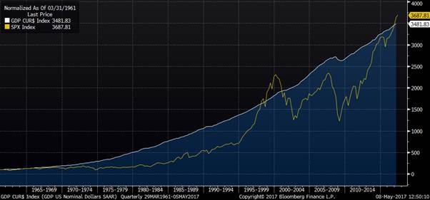
However, if your horizon is less than decades, nominal GDP is not such a clear driver of equity returns. In the very short run and even in the medium term of say 2 years, nominal GDP moves far less than equity prices do.

Follow-up Question “Does outlook for nominal GDP matter now for investment decisions?”

See later post

  1. Earnings as a share of GDP

Below is the chart from 1967 to now. Over a given 2-year horizon, we have seen material movements in S&P trailing EPS over GDP. Many are interesting, but the recent financial crisis moves stand out the most. Earnings were clearly volatile but amid the talk of bubbles, panic, and recovery of confidence, how important were they versus other drivers?


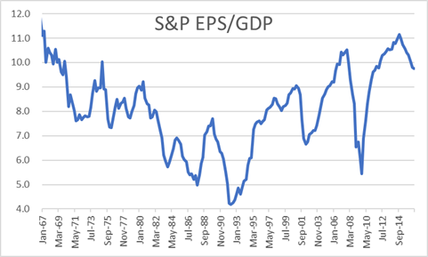
Example – Financial Crisis and recovery

During financial crisis earnings dominated.
For all the talk of animal spirits and how equity markets were highly erratic and emotional, the “boring” fundamentals of corporate earnings explained practically all price movements.

Follow-up Question “Outlook for earnings?”

See later post

  1. PE Ratio – Medium and Short term driver

Short term

In the short-run by definition PE ratio is the only thing that matters.
GDP data and earnings releases are only quarterly and so, for most days, the only thing that could have changed is the PE ratio.

You may argue that these daily changes in PE ratio are explainable and even predictable as they are driven by

i) Change in expectations of earnings

ii) Change in expectations of nominal GDP

iii) Change in yields in other substitutable markets

iv) Change in yield demanded from equities due to change in risk preferences or change in perception of risk

Radio and TV programmes are filled with a succession of strategists and pundits all required to “explain” yesterday’s market movement and these factors are therefore reached for repeatedly.

Unfortunately, these short-term changes are all too easy to explain away, given the limited range of explanations that are permitted. But you can tell that these “explanations” are also very hard to predict. The driver that is sometimes assumed is that the PE ratio change is due to rational updating of forecasts of GDP growth and corporate earnings. But markets are too volatile and erratic for that explanation to be compelling and talking about animal spirits is more natural.

Medium term

From the chart below you can see that the PE ratio is broadly unchanged over the past 50 years i.e. it is not at all a long-term driver of equities. But it is also clear that with a range of 7 to 30 it can have a huge impact on medium term price movements.
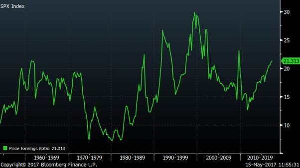

Example – 1980s

In the 1980s, for all the talk of the transformation of the US economy through the Reagan/Volker years combined with the “Greed is Good” era unlocking corporate value through increased efficiency, it was neither high GDP growth nor rising earnings that dominated the dramatic rise in equity prices. In fact, earnings as a share of GDP fell during this period and it was the rise in the PE ratio that drove prices higher.

One can think of this as a yield effect from the fall in inflation and the subsequent drop in bond yields. Lower bond yields drove yields lower in all asset classes, including property and equities. Lower yields mean higher prices and so we saw a huge bull market, commonly mis-explained by deregulation and improved business management.

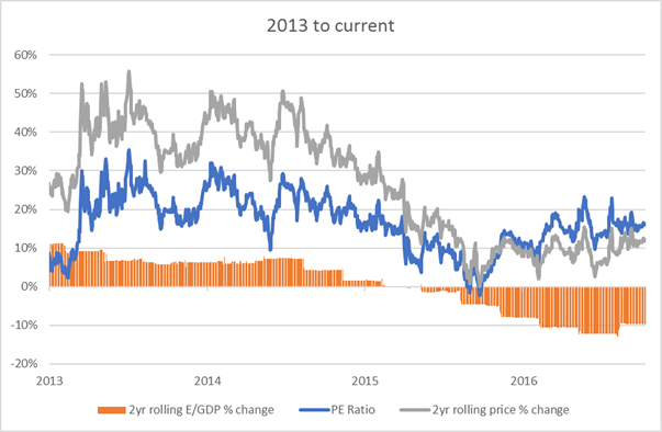
Example – 2013 to now


Over the past 4 years, the dominant driver has again been the PE ratio. Despite more confidence in the recovering economy, earnings as a share of GDP has not risen.

Again there has been a the yield effect with QE reducing yields in the bond market (https://appliedmacro.com/2017/05/23/framework-for-valuing-fixed-income-long-end/) and this has slowly filtered into other asset classes, such as equities, reducing yields and increasing prices.


Follow-up Question “Outlook for PE ratio?”

See later post

Conclusion

The framework of separating nominal GDP, earnings and PE ratio is helpful in describing what have been the historic drivers of equity markets. What we can do next is look at the current outlook for each of these drivers and from that the outlook for US equity markets.

Framework for FX valuation – where is the USD heading?

Here is a metaphor to explain how to approach a situation when there are conflicting potential drivers of an asset.

You are sitting on a small yacht, drifting in the sea. You want to know in which direction you will drift: onto those scary rocks or safely away from them. There are two potential factors which could be very important – the wind and the tide. The wind is the one you will be most aware of; but the tide could perhaps be very important even though it is less clear what it is doing.

If you ask for help you may find advice split into 2 camps. Those who believe that the wind is always the critical factor and those who believe that the tide is always the critical factor. This ideological split is not very helpful because there is no consistent answer to this problem. Sometimes the wind will matter more, sometimes the tide will matter more. You have to use your knowledge and judgement to decide how to incorporate those factors.

As for asset markets, this is a useful metaphor for many macro markets from fixed income, to equities to foreign exchange. A clear and important example of this today is how to position ourselves in the USD.

FX Model

Tide – Value (proxy is the real effective exchange rate)

Wind – Relative monetary policy.

Monetary Policy (Wind)

Most FX strategy I have read over the past few months has been bullish the USD. The most common argument relates to divergence of monetary policy. The Fed is raising rates when few other countries are, and with Trump these expectations became even stronger.

The relationship between the movement of a currency and the relative interest rates in those countries is a good one. If we look at the last decade of the Euro vs the US dollar then we see what a great first approximation it is.

But in financial markets, it is often a mistake to assume that something you have found that works well for a period is always reliable. It is not possible to treat macroeconomics or investing as having “Laws” in this sense.

If we look at the prior decade for the Euro, then the monetary policy model is terrible.

Value (Tide)

The other first approximation model I want to look is value. For this post, I will take the real effective exchange rate (REER) as a simple proxy.

It is clear from this chart that assuming a mean-reverting tendency in the REER would not have been at all useful in the past 3 years. The USD has been above its average value and heading higher strongly.

Maybe value only matters at extremes? Taking a longer view, adding bands of +/- 10% gives us a sense of how far the USD can move before a value constraint starts to be meaningful.

If you take the model for the yacht as the same conditions last time you went sailing, when there was not much tide and the wind blew you safely away from the rocks, this is not sensible. It would be particularly dangerous if there is a rip tide and you are ignoring it by assuming that a light breeze will determine your path.

Why is everyone talking bullishly about the USD?

  • Recently value has been a terrible model.
    The US dollar is expensive and going higher
  • Rates differential has been a great model
  • Simple extrapolation means that people believe rates will continue to be the best model in the future

Signs this may be happening now

The recent strengthening of the euro is often “explained” with reference to a potential change in QE from the ECB. But rates have not moved. So perhaps we are seeing the influence of a force we have not had to pay attention to recently. Value.

Conclusion

Macro investing is hard. The world is complex and confusing.  Over the years I have noticed many people fall into one of two traps

  1. Become fixed in a single view of how the world works and happily ignore or rationalise away contrary information
  2. Form a fluid view of the world which adapts to a model which can make the most sense of their recent experience.

The time we can make the most money from markets is when they are the most wrong. This can happen people are using the wrong model.

Models – How do computers play chess?

Chess computers have been good enough to beat me my whole life. It took until 1997 for them to beat a reigning World Champion, when Deep Blue beat Kasparov. They can now comfortably beat all the best players in the world. But development of Go computers has been far slower, it was only this year that AlphaGo defeated Lee Sodol, the 9 dan professional. What is the difference?

The most common reason given for why Go is harder, is that it is more complicated. In chess, there is a choice of 20 first moves, in Go the choice is 361. So in Go, the permutations and, as a result, possible games are far higher than in chess. Since computers play these games by simulating permutations, it makes intuitive sense that this is easier in chess than Go.

This argument is logical but highly misleading. The problem is that BOTH games are insanely complex and unsolvable by brute force. Imagine I am trying to move a pair of large rocks. One weighs 100 tonnes. The other weighs 10,000 tonnes. Is it sensible to say that the second is 100 times harder to move? Or simply that both are unmovable. Degrees of impossibility is not a very useful concept.

There is a more important difference between the two games. In chess we can build a simple model that acts as an excellent first approximation to evaluate who is winning. Just count the material and use a simple scoring of queen= 9 pawns, rook = 5 pawns etc. to come up with a single total for both sides. The one with the higher number is winning. This is how beginners think of the game, the aim is to grab material. Thus, it is easy to code a simple model to get the computer started. Once this first order approximation is worked out then second order models can be added such as pawn structure, space advantage or use of open files. In Go there is no such simple evaluation metric and how they managed to programme a computer to win is a fascinating topic and likely a separate post on AI.

A good first order approximation often gets you a decent way to a solution. If you don’t have this, you may have trouble finding a solution that doesn’t take an infinite amount of time to solve, as the early versions of Go computers found.

This has an interesting link to the way I approach financial markets and economics. I think it is most important to spend time thinking about appropriate first order approximations to help with the general understanding of what is really going on. But the influences around us often obscure this, for example from news or complex analysis.


Reminiscences of a Stock operator

I first read this book when I was 17 but it took me many years of trading and painful experiences to realise that the character who had the most to teach me was Partridge. He is the older, experienced trader who whenever presented with a stock tip by an excited young trader would always reply

“Well, this is a bull market, you know!” as though he were giving you a priceless talisman wrapped inside a million-dollar accident-insurance policy. And of course, I did not get his meaning.


Useful trading models

In economics and finance, it is the development and understanding of models of a first approximation that are the most useful and the most important. This is primarily the method I am using for models of asset market pricing described in other posts. Far too much effort and time is spent on far more “complex” analysis and models, which often focus on second or third order drivers by assuming away the first order ones. The “news” constantly blaring out on cable TV is at best a focus on factors causing minute differences in asset prices. At worst, it is just distracting white noise. Precise directions for the last 100m of your trip are a not much use if you are not sure which town you are going to. It is far better to be approximately right than to be precisely wrong.

Trade Ideas

A common type of trade idea proposed to me will be in this form:

  1. There is a recent development or upcoming event which matters for the Australian dollar (substitute in any other market) e.g. a piece of economic data
  2. We should buy/sell it

What is rarely done however, is considering how important this driver is in context. Commonly the idea is logical but essentially rests on the idea that the current market price is already correctly priced. This approach fits well with many people’s education in which assumptions of efficient markets are often embedded without them realising. The reason that these trade ideas often fail is that the new information will only dominate the market movements if and only if the more important drivers of the currency are correctly priced. Instead of assuming the market is fairly priced, I would prefer to question whether this first order approximation is appropriate before moving on.

Australian Dollar Example

To use an Australian dollar example, the value of the currency doubled between 2001 and 2008

It did not rise like this because of a succession of incremental pieces of random news which happened to cumulate in a massive movement. It happened because the currency was by first order approximation far too cheap. A useful first order approximation model for currencies is Purchasing Power Parity (indices are freely available and calculated by the OECD). The chart below shows that the PPP of the AUD was very steady at around 0.70 cents. In 2001 it was very cheap, and when it approached parity it was very expensive. Capturing these kinds of move is where I spend my time and historically where I have made my biggest profits.

Conclusion

I have learned to focus on the bigger picture and look for large market movements. In my experience, these are most likely to happen when the market price is a long way from a good first approximation model. I therefore put time into building these first approximation models across asset classes as I have briefly described so far in fixed income, and will follow up with ones on currencies and equities. Just as in chess, a good understanding of a first approximation model can get you a long way. Focusing on very new information or complex models which are actually third order features, while neglecting the first order drivers, only leads to confusion and major mistakes.

How to reduce your Risk Part III

Trick question (click here for the question, and here for the answers)
There is no right answer because risk cannot be minimised.
It can only be transformed from one type into another.


What did people choose?

Option A was the most common answer. For those who trade in financial markets, this may be surprising.

If I reframed the question and asked:

  • Please calculate the DV01 of Options A and B
  • Please calculate the VAR of Options A and B
  • Please tell me which of A or B has greater risk

You would quickly work out that B has zero DV01 and zero VAR. Hence by the definition of risk used on trading floors, A has higher risk. Unsurprisingly asking this question to a room of traders at investment banks, I get the overwhelming answer B because that is the context in which they think about “risk”.

If I ask the question to people who work in property or private equity, then I am more likely to get the answer A as certainty of cashflow is critical, especially when thinking about assets and liabilities. In the accrual accounting world of regular banking, they think about Earnings at Risk (EAR) and Option A is the way to reduce the risk.

The answer given likely relates to your personal circumstances and the exact framing of the question. If I had the time running a series of experiments with slightly different wording, rates or quantities I think would give interesting results.

But for now, the practical lesson is important. People do not instinctively understand risk at all well. We are presented with questionnaires from investment advisors which ask us for our risk preferences with no definition of risk. From the results of typically recommended portfolios, it would suggest that bonds are low risk and equities high risk.

My approach

I think that the best way to think of this question is in terms of a balance sheet. Whether choice A or B “reduces” your risk depends on the extent to which it matches the tenor of your liabilities. If your liability is short term then Option B is the sensible answer. For investment banks, they have no corresponding long-term liability apart from capital. They typically hold wafer-thin amounts of capital against market-to-market assets so naturally recognise A as a risk. For someone who is keenly aware of what they see as fixed longer-term liabilities such as paying school fees or retirement expenses then the choice of a long-term asset i.e. Option A, is far more natural.

Risk matters

Whenever risk gets mentioned, I very rarely observe a discussion of this nature. Often only one side of the balance sheet is being examined and the vastly important implicit assumptions from the liability side are not considered. I am an advocate of multiple forms of risk measurement, including VAR, but only if it is used in the correct context. Many of the worst financial disasters have occurred by taking a risk and accounting concept that was appropriate in one context and transplanting it to another. AIG and Enron are the biggest ones that spring to mind.