Framework for valuing fixed income – Long end

I do a very different analysis of the long-end of the yield curve, compared to the front-end. (Framework for valuing fixed income – Front end) Mathematically, you could take the same approach and bootstrap the curve from a complete set of forecasts of short-term rates for the next 30 years. But this seems a bit silly and begs the question of how you would get these forecasts anyway.
To simplify the analysis, what we have to work out is what the long-term “equilibrium” rate will be and ignore for now how we get there or use the analysis from the front end to build a path.

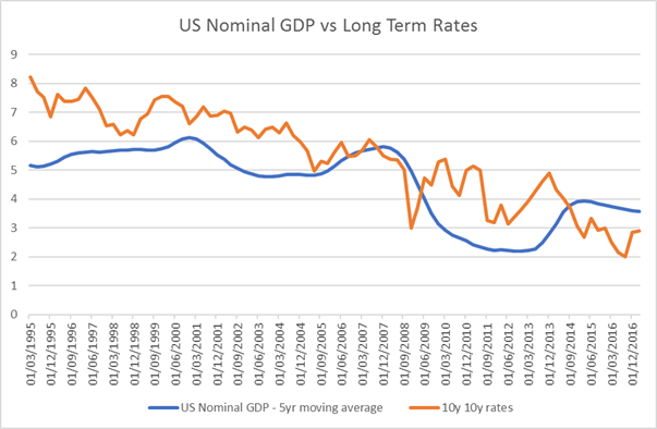
Simple Hypothesis: Long-Term rates = Nominal GDP

An approach that appeals to me is to look for a link between long term interest rates and long term nominal GDP. I think of it as a “Wicksellian” natural rate which the market will tend to revert to i.e. If interest rates are consistently far away from the growth rate of nominal GDP then there would be a persistent drag or stimulus to growth which would not be sustainable. You can get to a similar idea from several different economic frameworks.

If we look at the data then, the hypothesis looks reasonable. Below is the 10-year average of nominal GDP growth alongside the 10y10y interest rate for the US. The 10y10y rate is the rate you can calculate as what the market implies the 10y interest rate to be in 10 years’ time.

Before the early 2000s, interest rates were consistently a little higher than GDP. Academics were happy with this and explained it in terms of some type of premium which bond owners would demand to own bonds. They were then confused in the early 2000s by the “conundrum” that long term yields dipped, explaining it either by Chinese ownership of Treasuries or a global “savings glut” which was forcing down yields.

Outlook for Nominal GDP

Current yields do not look very remarkable to me, but they are only correct if you think that nominal GDP will remain as low as for the past decade. The most prominent argument that we should expect this to continue comes from Larry Summers and his promotion of the idea of “Secular Stagnation” – http://larrysummers.com/2016/02/17/the-age-of-secular-stagnation/

I find these arguments a little hard to engage with as we must recognise how utterly useless long-term forecasts of anything generally are. I should admit that I am not a big fan of anything which looks like a restatement of the savings glut theory to me, but I do not want to engage here in an academic debate. As a more practical question, I think that the burden of proof is on ideas such as Secular Stagnation and the “New Normal” that the world will need permanently far lower rates than it has in the past. Arguing that nominal GDP will be lower, due to slower population growth, demographics and potentially lower productivity is easy. Explaining why it is 3% lower is not so easy.

My view is that this economic cycle does not require new theories to explain it. A financial crisis results in a very deep recession and leaves scars which mean the recovery is slower than many expect. These hangovers from the financial crisis are what Yellen refers to as “headwinds” which are slowing down the economy. Risk aversion among consumers and businesses after such a bad recession is only to be expected and the impairment of the credit channel after such a disruption is also understandable. But there is no reason to think that these headwinds are permanent. They can abate and we can return to a world similar to the one before, both in terms of the level of nominal GDP and also the relationship between interest rates and growth. The financial crisis has been traumatic, especially for countries like the US and the UK, that have not seen one like this recently. However, the history of financial crises is that they are worse than people think, but they are not permanent.

Are we renormalizing?

Unemployment fell slowly but is now down to 4.5%. wages have been sluggish but are now picking up.

If I draw the first chart again but this time use a 5yr rather than 10yr moving average then perhaps I can argue the market is reacting too slowly. Nominal GDP has been rising recently and with rising wages and inflation can easily be seen to be likely to continue to do so. If that is true then market rates are too low.

Why are long term rates still so low?

The idea that long term rates are too low is hardly new. After all this was the whole point of QE!! The central banks buy huge amounts of long term debt to drive up bond prices and yields down. This helps to stimulate the economy and boost other asset classes which look relatively cheaper to bond markets, and so drives reallocation flows.

As I mentioned in this post (https://appliedmacro.com/2017/05/01/government-debt-framework-uk-follow-up/), we are living in a new era of financial repression. Therefore, I really do not need any grand theory from the supply side of the economy to explain low rates. I just look at the huge boost in demand for bonds from the central banks.

Is there a catalyst for change?

  1. One potential catalyst would be from the front end. If the Fed hikes rates faster than the market expects, then this can cause a shock to ripple down the whole curve. We saw an extreme version of this in 1994.
  2. If wages start to accelerate then the Fed, economists and market participants would have to radically reassess their assumptions about the inflation outlook and the appropriate level of rates. If you are very confident this cannot happen, you have more faith in our understanding of this type of macro variable than I have.
  3. Even without any fundamental driver we may see a repricing simply from a change in the supply and demand dynamics of the bond market.

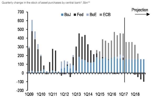
QE buying has been high for the past few years but it is finally slowing down. This may be the catalyst for a repricing of bonds.

Conclusion

A simple and yet historically useful framework for considering long term rates is to use nominal GDP. In recent years, we have seen the combination of a major downshift in long term expectations for both nominal GDP and the level of rates relative to nominal GDP. While many arguments justifying this change as permanent have some merit, I think that they are more temporary then current market pricing implies. Which means that I do not think that bond markets are cheap. In fact, I think they are wildly expensive.


Framework for valuing fixed income – Front end

In a previous post, we looked at a model of relative value of equities versus bonds (https://appliedmacro.com/2017/05/09/are-equities-expensive-part-i/).
But it does beg the question of whether bonds are good value themselves.

I am not aiming for a full review of global bond value, I will focus purely on the US market. In this post, I shall look at the front end of the curve and in a later post the long end.

Expectations

The simplest and best model for the short end of the yield curve is the expectations hypothesis.
The yield is an average of short-term interest rates that are expected to prevail through the life of the security


Such expectations may not match the market yield, so there may be a residual. This residual r is sometimes called the premium (choose any: risk premium, term premium, liquidity premium, it does not matter which). At times such as during the financial crisis, I spent a long time modelling precisely the premia, but in normal market conditions it’s not very productive. Merely knowing if the premium is large or small, positive or negative is sufficient.

The other term often used for premium is expected return. If you think in terms of academic “efficient market” models or asset allocation in a real money environment, then you may prefer to use excess return but the language does not matter here.

US Front End

In the US, the Federal Reserve effectively sets short term interest rates, the Fed Funds rate, and these days they helpfully publish quarterly forecasts of where the committee thinks it will be. A sensible starting point is to compare these forecasts to the tradable yield and calculate the residual.


If you have not been following fixed income markets for the last few years or have learnt how markets work from finance textbooks, you may find this chart surprising.
We, as market participants, are well used to the fact that the market is pricing that rates will be significantly lower than the people who set them expect them to be. This has been the case for a long time but so far, the market has been better at predicting how the Fed will behave than the Fed itself.

If we look at a chart over the past 2 years where rates have been expected to be at the end of 2018, we see some fluctuations but very little net movement. In contrast, the Fed has been consistently revising lower its forecasts of where it thinks rates will be.

If we cannot just assume the Fed know what they will do, we must form our own opinion on where rates might go and determine whether the market is under or over pricing the path. The way to do this is to break down the elements of the forecast and analyse each of them.

The Fed’s reaction function & the Taylor rule

To start with the obvious, the Fed decision can be thought of as a function of things they care about. It is often called their “reaction function” and the things they care about are employment and inflation, their explicit objectives as given to them by Congress.

A common and useful form of this is the Taylor rule, which models Fed behaviour on just two variables.


Using this to make investments

The Taylor Rule is not that useful as a predictor of rates, but it forms a useful framework to think of what drives them.

There are 3 obvious places where you can disagree with the market and so make an investment call.

  1. A different view on growth

One of the largest and most obvious trades in my career was short term rates in 2002. The economy had been very poor in 2001, but the memory of the bubble was perhaps still so vivid that the market priced a rapid rebound in growth and thus interest rates. 2002 did not turn out to be the year of recovery and rate expectations fell accordingly all year.

  1. A different model of the economy

A good example of this would be 2008. Even after Lehman went under in October 2008, it took a long time for people to understand how serious it was and the devastating impact on the broader economy. The market was still pricing that rates would be nearly 3% at the end of 2009. They ended up close to zero. Rates eventually plummet in 2008 because the economy is falling apart.

A counter-example where a commonly believed idea turns out to be wrong is the idea that Quantitative Easing (QE) is going to lead to high inflation and so bonds will collapse. This comes from the idea that inflation is caused by “money” and the Fed is “printing money”. A simple and appealing argument that comes from a misunderstanding of what “money” is and how the monetary and banking system works. (a good topic and controversial later post I am sure).

  1. A different view on reaction function.

An example here would be that after the crisis many people were very premature in thinking that the economy would get back to normal.

In the summer of 2013, rates were still zero and the Taylor Rule suggested that was appropriate. But taking the economic forecasts at the time and projecting what that meant, suggested that rates would be much higher. So back in 2013 the market was pricing that rates would currently be about 3 %. In fact they are around 1%.

This difference is not because the economic growth forecasts were wrong. But the reaction function was. If you listened to Fed Chair Yellen’s speeches she was clear that the Fed would be very “patient” in raising rates. They desperately wanted to avoid hiking prematurely and actually wanted inflation to be higher. So a new reaction function should have been understood – that the Fed were waiting longer to hike to get the economy to be running hotter.

What about now?

My experience of financial markets is that is that expectations are more commonly adaptive than rational. By this I mean that humans (including market participants) tend to overweight recent experience. Given that the Fed has been consistently too high in their forecasts for the last few years, people expect that will continue to be the case. I am not so sure.

I am inclined to use an even simpler new reaction function for the Fed based upon wages. In previous cycles, they would hike before wages rose because

  1. They were confident in the economy
  2. Inflation and wages were high enough already to take a risk if they go lower again
  3. Wages are a lagging indicator, so by the time wages rise the economy will have been running too hot for too long

This time they want wages and inflation to be higher before they even start. The data suggests to me that wage growth is finally recovering.

It is reasonable to think that the economic cycle works the same now as in previous periods, and so wages are a lagging indicator. That means that the labour market has been tight for a while now and is continuing to get getting tighter adding more upward pressure on wages.

Conclusion

This cycle has been very different from prior periods because

  1. The recession was very deep
  2. The recovery was slow
  3. The Fed wanted to wait until they were sure they needed to raise rates.

This has meant that being long the front end has been a reasonable trade for a long time i.e. the front end was cheap against my expectation of where the Fed would set rates. But with the signal that wages are finally rising, we may be approaching the end of this phase. Furthermore, with so little still priced for rate hikes from the Fed the front end does not look good value to me.

If the US recovery has been slow, but the economy not long-term impaired then this means that the rate cycle has been delayed, not that it is not coming or that where rates end up will be so much lower than in previous cycles. But that is the topic for the next post.

Government Debt Framework – UK Follow-up

Relevance to the present

Previously, we looked at the UK government debt in the post WW2 period.

Two clear questions arise –

“How did the UK manage to keep its rates so far below nominal GDP?”
“Should we expect to be able to do the same in the future? “

The key to inflating away national debt is the ability to force domestic investors to hold government debt at well below the yield they would get in a free price-setting environment.
Sometimes this is reported as financial repression.

Again, this paper does a really good job of giving the details of the post WW2 period. https://www.imf.org/external/np/seminars/eng/2011/res2/pdf/crbs.pdf

Comparison post WW2 period to Current

I am interested in the extent to which the situation could be the same for other countries today.
My bias is that it would be significantly more difficult and we should not assume that because it worked in the 1950s it will work today.

  1. Ability to force domestics to hold govt debt
    This is probably the easiest and we are seeing plenty of this at the moment.
    e.g. pension funds and banks being required to hold government debt for “liquidity” or “prudence”

But the danger of the current system is leakages

  1. Capital controls
    Post war Bretton Woods we had globally imposed coordinated capital controls that reinforced home bias. In effect, countries agreed not to compete for capital through the price mechanism. I see this as a form of cartel which managed to hold together until the 1970s. We are a long way from that kind of cooperation today.
  1. Ownership of debt
    It is much easier to coerce domestic investors than foreign ones. In many heavily indebted countries, the issue is that debt markets are owned by foreign investors. This was a big factor in the Asian crisis of 1997/8 and the Mexico crisis of 1994. Currently, the Gilt market is 25% owned by overseas investors which makes it perhaps a little vulnerable. In contrast Japan has a higher debt level but virtually all the debt is owned by domestics.
  1. Trade surplus/deficit
    Post WW2, the UK was close to balance and now has a large deficit (over 4%). This deficit needs external funding which currently comes from FDI. All this adds extra pressure and vulnerability to the situation.
  1. Sensitivity of average rate on the of debt
    In ideal world, the debt market would be structured as conventional Gilts with as long tenor as possible whilst running a primary surplus to offset the interest payments. Even if short rates and inflation rose, the rate paid on the debt would stay the same thus somewhat mitigating rollover risk or the risk of paying much higher rates overall. Unfortunately, this is not the case in most developed countries as QE has been making situation worse.

QE shortens duration of the debt market

One way to think of QE is as a shortening of the duration of debt issuance (another post I think) then the impact on the debt profile is to significantly shorten it. In this light, QE on the Bank of England’s balance sheet simply means that rather than having a £435bn liability of long duration it is paying overnight rates on bank reserves. When (/if?) the Bank raise rates then they are immediately paying higher rates on the debt. (note debt and liability mean the same thing here).

Below is a chart of the average duration of the Gilt Market since 2000

image0011


Final Thoughts

I have frequently read the argument that we can inflate our way out of our current debt problems by having faster growth and inflation. The obvious flaw in this argument is it requires independence of nominal GDP growth and interest (i.e. Central Banks would not raise rates in the face of higher nominal growth which is clearly not the case). In the modern market economy, nominal growth and interest rates are highly related and so just assuming they are not is both bizarre and surprisingly common. Alternatively, you can concede that there is a link between growth and interest rates but remain very confident in the ability of modern nation states to impose financial repression with no leakages.

From my understanding of the modern financial system, I do not share that confidence that current debt levels can be easily reduced and therefore, I do not think they can be raised with impunity. It does not however follow that I become an austerity-hungry debt and deficit hawk.

This debate that I read between economists and political commentators appears depressingly partisan with far more noise and anger than analysis. What really matters is whether the current situation is risky enough to merit policy action or, as investors, some active asset re-allocation. This is highly complex but in my view, economic analysis is falling short in its ability to help. If your answer to the question of whether government deficits should be higher or lower is the same at all times, across all countries, then I would suspect that your economic model is not going to be very helpful in making policy or investment choices.

Government Debt Framework – UK

Introduction

For anyone interested in the long-term investment outlook for fixed income, or more simply the future of our current sovereign nation states, an understanding of government debt must be a key element. Much is written on this subject but I find a lot of it confusing with partisan politics dominating analytical perspectives and terminology which is often inconsistent and emotive.

In this note, I want to focus on episodes where large debt level has been managed.
The large debts of WW1 and the Great Depression were reduced, on the whole, by various types of default. These always come with large economic costs and are to be avoided.
The period after WW2 is more interesting, commonly used as evidence as grounds for optimism and as grounds for opposing “austerity”. (in quotes as this term is generally emotively used by the opponents of current fiscal policy and has a pretty loose definition and usage)

(This paper by Reinhart and Sbrancia does a nice job of laying out the economic history. https://www.imf.org/external/np/seminars/eng/2011/res2/pdf/crbs.pdf)


Government Debt Model

So, I thought I would start by making a simple framework within which I can look at debt dynamics. Breaking down the change in government debt into 2 parts:

  1. Primary surplus
  2. Interest payments

(put simply Overall Deficit = Primary deficit + interest paid)

Note, this is not intended to be a complete model as there are clearly other factors which can change the debt level. For example

  • Change in currency level for foreign-denominated debt
  • Change in yields leading to change in market value of the debt
  • Due to Extraordinary items e.g. the government takes on additional debt which for accounting reasons they do not show up in the primary deficit

But it is pretty decent and captures the vast majority of the debt dynamics, certainly all of the ones which drive long-term trends.


Model UK Gilt History

Here is the model vs actual data since WW2 for the UK.
image001

There are two clear episodes (~1974 and ~2008) when the actual increase in government debt were far larger than the model would suggest. It would be nice to understand what drove it (for example, in the financial crisis, did the government balance sheet absorb private sector banking debt without having it showing up in the deficit?)

Below is the chart of UK debt since WW2

image002

It is commonly described that the UK ran deficits thought this period and the debt level was brought down by high growth. This is not incorrect but I find it a bit narrow and misleading.

Budget Deficit v Primary Deficit

First, the idea that the UK ran deficits. Well it is true but if you split the deficit into primary surplus/deficit and interest payments then the picture looks quite different.

image003

During the 1950s and 60s, the UK run a deficit virtually every year. But we can also see that the UK ran a primary surplus for the entire period. So the reason the UK ran a deficit was simply that the debt levels were very large and so the interest payments were very large.

Whilst it is true that the main way the UK brought down its debts level was running nominal GDP at a higher rate than the interest rate paid on its debt, compounding effects are huge (running this for a long time) particularly when the debt level is large.

Between 1947 and 1951, debt levels fell from 246% to 165% of GDP. The cumulative primary surplus over that period was 29%, so the balance, about 2/3, of fall in level came from the impact of nominal GDP vs the rate on the debt. compared with only 1/3 from running large primary surpluses.

image004

Relevance to the present

How did the UK manage to keep its rates so far below nominal GDP?
Should we expect to be able to do the same in the future?