
First, let’s refresh our memories of what correlation means.
This may seem very basic right now, but I would like to make sure the meaning is clear before we move on to its use.
I have included a question at the end, once you have read and thought about the definition:
- A definition from the FT Lexicon:
“a correlation is said to be positive if movements between the two variables are in the same direction and negative if it moves in the opposite direction.”
- You can read examples in a number of sources such as
https://www.mathsisfun.com/data/correlation.html
and
http://www.bbc.co.uk/schools/gcsebitesize/maths/statistics/scatterdiagramsrev2.shtml
Here is a range of correlations, shown via a scatterplot:

Some important concepts
- A positive correlation is “when the values increase together”
An example would be temperature and ice cream sales as “warmer weather and higher sales go together”. - A negative correlation is “when one value increases and the other decreases”
Note this is sometimes called an “inverse correlation”.
An example would be weight of a car and its fuel efficiency as “cars that are heavier tend to get less miles per gallon.” - No correlation is when “there is no connection”. An example would be IQ and house number.”
- For those of you with a more formal approach the mathematical formula for correlation is:

- In practice, most of us find it much easier to use the function CORREL() in Excel!

Question time
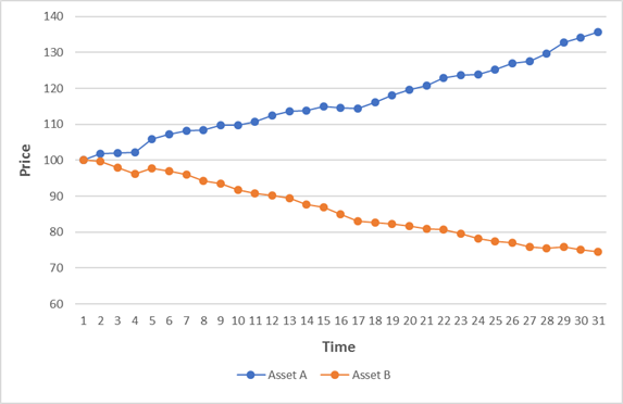
Here is an example with two asset prices A and B. When we represent the data in a chart it can often be done in one of two ways.
This chart has two lines, showing how both the prices of asset A and B moved over time.
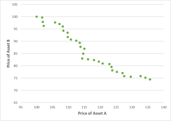
The other way to chart this is to put the prices of A and B on the two axes instead. It looks like this.
To make sure you have understood the basic concept of correlation, I would appreciate it if you could vote on an answer to the following question. (all anonymous of course!)

3 thoughts on “The misuse of Correlation Part 1 – Quick Refresher and Quiz”