In previous posts, I have written up ideas on primary drivers and first approximations for fixed income and foreign exchange markets, and I now want to continue with equity markets (Click here for Framework for valuing equities Part 1). This is a little more complex to explain so will take a few posts to go through the steps.
Most equity analysis I read starts from the bottom up. The analyst knows a lot about individual companies or sectors and will extrapolate from there to the broader index. Or if some macro analysis is performed, it assumes some form of “conventional wisdom” such as high growth means higher equities.
I want to start with a top-down equity valuation and so I find a useful way to begin is to break the equity price into components. Then I can compare equities to GDP and the economy, things that I am familiar with already.
This framework can be applied to all equity markets but will start here with the US and the S+P 500.
Breakdown of the Equity Price
Using some very simple algebra:
Price = (Price / Earnings) * Earnings

Price = (Price / Earnings) * (Earnings / Nominal GDP) * Nominal GDP

Focus on the Components
Eventually, I will I look at how these variables relate to each other, but first let’s start examining each in turn:
- Nominal GDP Long Term Diver
- Earnings Medium Term Driver
- PE Ratio Medium and Short Term Driver
- Nominal GDP
In the long-run, Nominal GDP is the only thing that matters for equity prices.
Nominal GDP is 35 times bigger than it was in 1961 and the S+P Index price is 37 times higher. Fundamentally, if you are a long-term investor and just stay long equities, then the rising tide of growth will lift you to large compounded returns over the decades.
However, if your horizon is less than decades, nominal GDP is not such a clear driver of equity returns. In the very short run and even in the medium term of say 2 years, nominal GDP moves far less than equity prices do.
Follow-up Question “Does outlook for nominal GDP matter now for investment decisions?”
See later post
- Earnings as a share of GDP
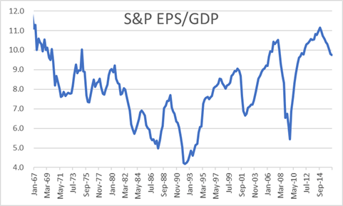
Below is the chart from 1967 to now. Over a given 2-year horizon, we have seen material movements in S&P trailing EPS over GDP. Many are interesting, but the recent financial crisis moves stand out the most. Earnings were clearly volatile but amid the talk of bubbles, panic, and recovery of confidence, how important were they versus other drivers?
Example – Financial Crisis and recovery
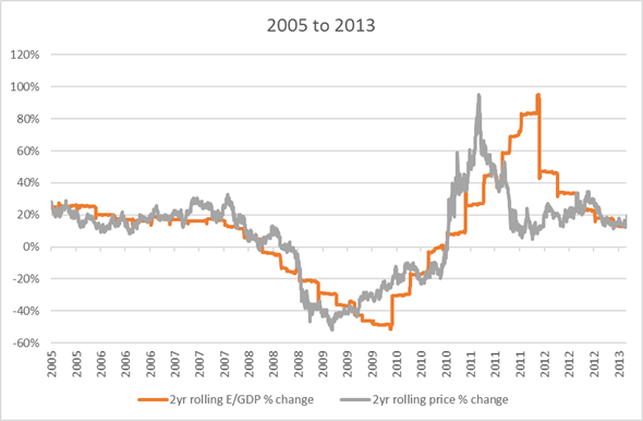
During financial crisis earnings dominated.
For all the talk of animal spirits and how equity markets were highly erratic and emotional, the “boring” fundamentals of corporate earnings explained practically all price movements.
Follow-up Question “Outlook for earnings?”
See later post
- PE Ratio – Medium and Short term driver
Short term
In the short-run by definition PE ratio is the only thing that matters.
GDP data and earnings releases are only quarterly and so, for most days, the only thing that could have changed is the PE ratio.
You may argue that these daily changes in PE ratio are explainable and even predictable as they are driven by
i) Change in expectations of earnings
ii) Change in expectations of nominal GDP
iii) Change in yields in other substitutable markets
iv) Change in yield demanded from equities due to change in risk preferences or change in perception of risk
Radio and TV programmes are filled with a succession of strategists and pundits all required to “explain” yesterday’s market movement and these factors are therefore reached for repeatedly.
Unfortunately, these short-term changes are all too easy to explain away, given the limited range of explanations that are permitted. But you can tell that these “explanations” are also very hard to predict. The driver that is sometimes assumed is that the PE ratio change is due to rational updating of forecasts of GDP growth and corporate earnings. But markets are too volatile and erratic for that explanation to be compelling and talking about animal spirits is more natural.
Medium term
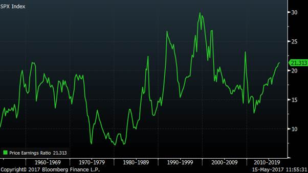
From the chart below you can see that the PE ratio is broadly unchanged over the past 50 years i.e. it is not at all a long-term driver of equities. But it is also clear that with a range of 7 to 30 it can have a huge impact on medium term price movements.
Example – 1980s
In the 1980s, for all the talk of the transformation of the US economy through the Reagan/Volker years combined with the “Greed is Good” era unlocking corporate value through increased efficiency, it was neither high GDP growth nor rising earnings that dominated the dramatic rise in equity prices. In fact, earnings as a share of GDP fell during this period and it was the rise in the PE ratio that drove prices higher.
One can think of this as a yield effect from the fall in inflation and the subsequent drop in bond yields. Lower bond yields drove yields lower in all asset classes, including property and equities. Lower yields mean higher prices and so we saw a huge bull market, commonly mis-explained by deregulation and improved business management.
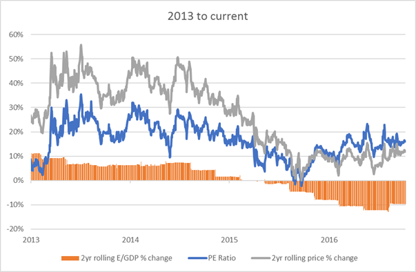
Example – 2013 to now
Over the past 4 years, the dominant driver has again been the PE ratio. Despite more confidence in the recovering economy, earnings as a share of GDP has not risen.
Again there has been a the yield effect with QE reducing yields in the bond market (https://appliedmacro.com/2017/05/23/framework-for-valuing-fixed-income-long-end/) and this has slowly filtered into other asset classes, such as equities, reducing yields and increasing prices.
Follow-up Question “Outlook for PE ratio?”
See later post
Conclusion
The framework of separating nominal GDP, earnings and PE ratio is helpful in describing what have been the historic drivers of equity markets. What we can do next is look at the current outlook for each of these drivers and from that the outlook for US equity markets.


