You can also find this link on the home page of this blog by clicking the ‘Substack’ button in the top right
I will be posting new material on substack and will no longer be posting on this blog.
Below is a copy of my new post, the introduction to a new series exploring whether we are currently in a stock market bubble. The follow-up pieces can be found on substack.
The 2026 Stock Market Bubble
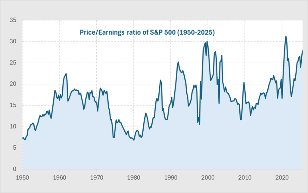
The US stock market sits at levels that look extreme by any historical comparison. These extraordinary times require a more rigorous analysis than just high Price-Earnings (PE) ratios or anecdotes about AI company valuations.
If you have investments, such as a pension, 401(k) or an ISA, you need to make decisions about how you allocate your assets. Whether or not OpenAI is worth $840bn is not relevant to you, it is a private company. What matters to you is whether the broad public market is cheap, fair value or expensive.
Today’s elevated PE ratio in the S&P generates a lot of press attention, but it simply reflects strong optimism about future earnings. That alone cannot tell us whether we’re in a bubble like dot-com in 2000 or on the early stage of AI driven earnings revolution.
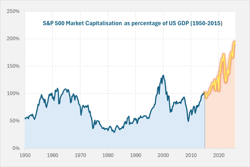
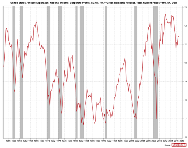
The US stock market has become enormous relative to the size of the economy. Below we show the value of US equities as a share of overall GDP. It is double what it was a decade ago, and far higher than we saw in the dot-com bubble of 2000.
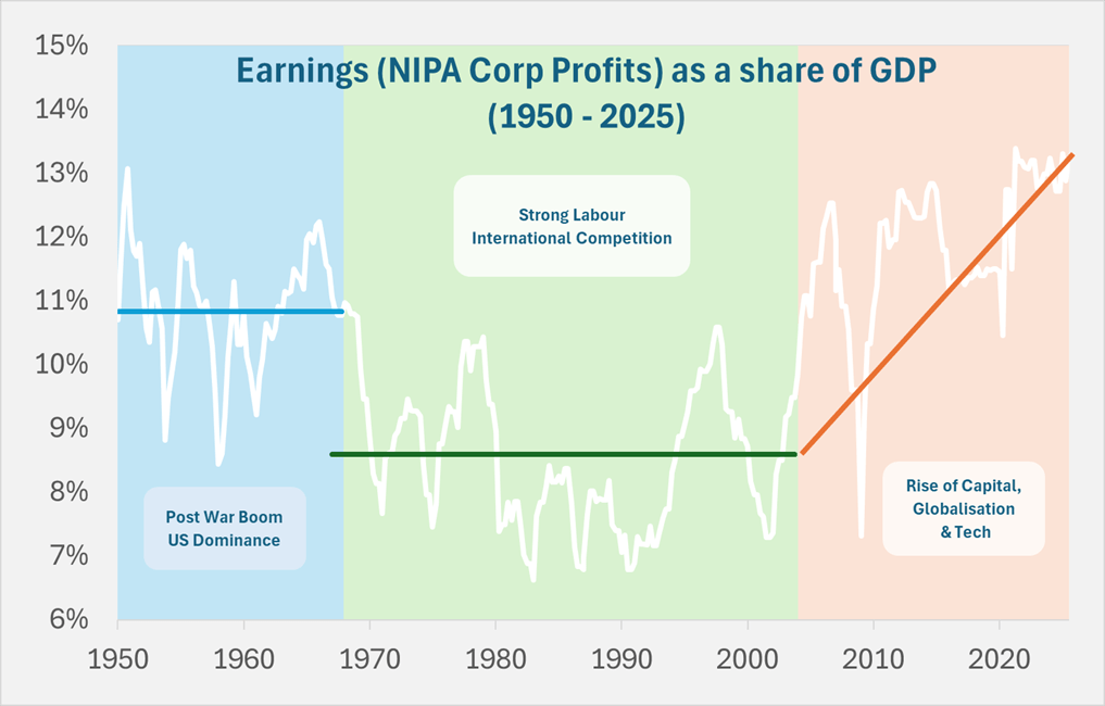
The reason this chart looks more extreme than the simple PE chart is that underlying earnings as a share of GDP has already reached unprecedented levels over the past twenty years. This rise in corporate profits from around 8.5% to 13% of GDP has seen wages stagnate, widening economic inequality, and a political backdrop marked by discontent and populist movements such as MAGA.
Current valuations show the same level of optimism about future earnings growth as in 2000 dot-com bubble, except today’s level of earnings are far higher. It is this combination that is so extreme.
What would this earnings share need to be over the next decade for your stock market investment to simply keep pace with GDP growth? The chart below shows
The projections are stark.
Current valuations assume future jumps in profitability that dwarf anything ever seen. Can AI really deliver a surge in corporate profits far beyond the gains achieved in the last waves of globalisation or past technological booms?
This series will continue on substack and examines the extraordinary claims behind these extraordinary times.
I am confused by the calm coverage of the recent radical shift in economic policy – described by the BBC as “bid to boost growth”. This type of reporting does not make clear whether we are talking short-term growth or long-term potential, and how these policies impact each of them in very different ways. From conversations with friends, much of the analysis does not investigate this and ultimately reveal just how dangerous and radical this new set of policies is.
Potential Output – what is it?
Truss has justified her policy changes economically citing improvements in the UK’s long-term growth potential i.e. increasing potential output
Potential output is the starting point for thinking about how much the country can produce ie it is the maximum sustainable level of output.
If we are below, then this is called a negative output gap and we see things like unemployment rates being high and inflation likely falling.
The OBR does a great job on this and their website is very clear
Potential Output – how can we improve it?
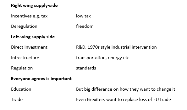
Everyone wants to improve potential output and there is a clear left vs right divide on how best to achieve it.
Truss is firmly in the right-wing supply-side movement of “trickle-down” i.e. give tax breaks to rich people and everyone will be better off because somehow this leads to greater potential output. Reagan was the most prominent exponent of this view but we are still waiting for any evidence that it works.
Potential Output – will it work?
I think best to simply summarise that there is no evidence that cutting taxes has any positive effect on potential output. OK – so if Trussonomics does not improve potential output, what does it do?
It does a LOT
The most obvious and direct impact is of course on inequality. She is delivering a massive cash handout to rich people. The richer you are the more you get.
The part that is getting less attention is the impact on
Fiscal vs interest rate policy mix
Debt sustainability
Fiscal vs interest rate policy mix
This policy choice has been perhaps at the heart of the political battle of the past decades and is commonly misunderstood. This is a shame as a simple quadrant model does a good job of providing a framework to compare the options clearly. (Fiscal policy is the mix of tax and spending with high spending/low tax being loose fiscal policy)
Tight fiscal -tight monetary When you are committed to fighting inflation above other policy goals. For example, the 1980s or commonly after an economic crisis when trying to rebuild confidence in the currency and debt. If used inappropriately looking at the 1930s Great Depression.
Tight fiscal – loose monetary This is the Cameron years. There is of course a debate over how tight fiscal policy should have been and on how the mix of tax and spending was managed. But it is a consistent policy mix
Loose fiscal – loose monetary This was at its maximum during the pandemic i.e. for a short term huge negative shock. If used long term it just leads to economic catastrophe.
Where are we now?
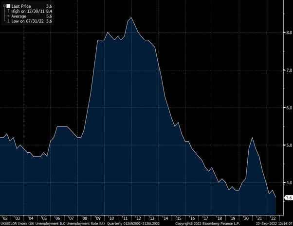
We are currently in the loose/loose box. Taking the unemployment rate as a simple measure of the output gap, you can see from the chart below we are at record lows. This is also clear to anyone trying to hire at the moment and all the reports of staff shortages. Which makes it odd that Truss talks about “boosting growth” as there is no prospect of lower unemployment from here.
UK Unemployment at record lows
The other factor that makes going for growth an odd policy goal is that inflation is high and rising. This does not have an easy solution and economic pain is unavoidable. Trying to avoid it, leads to even greater pain later.
UK Inflation at 30-year highs
What happens next?
The Bank of England will be forced to raise interest rates by huge amounts. At the start of this year the market expected interest rates to stay at around 1% though 2022 and 2023. Now the market expects rates to be 4% by the end of this year and 5.5% by the end of next year- with rate expectations for next year shifting 3% since the start of August.
What does this mean for people?
Well rich people have had a large tax cut and will be fine – I know you are all relieved to hear this.
Anyone on a regular income has had a small tax cut but this will be dwarfed by the rise in the mortgage payments coming soon.
What does it mean for the economy?
I predict a very bumpy path and hard landing for the economy but difficult to say when. The policy mix of vast fiscal expansion at a time of low unemployment and high inflation to be offset by rapid interest rate rises is a chaotic mix. I think the economy will stay strong and then crash hard.
Debt sustainability
This is getting some attention but is being dismissed by Truss. The fact that they did not let the OBR produce a forecast tells us a lot about how they have contempt for this constraint on policy. An Office of Budget Responsibility is not what the Chancellor wants to hear from!
But the bond market still exists, and long-term government borrowing is getting hammered. 30-year Gilt yields have risen from under 1% at the start of the year to 4% as I write this.
The tax cuts and extra spending increases the budget deficit. The rise in interest rates increased the cost of servicing the debt, further increasing the budget deficit. This can become an exponentially explosive mix with the major accelerator being a currency crisis as the value of sterling falls.
Conclusion
The Trussonomics experiment is radical and dangerous. I expect high inflation, high interest rates and a weak currency leading to economic crisis. Politically I expect her to start to blame the Bank of England as though the rise in interest rates was not a direct result of her policies. The Bank of England may be independent of the government, but they are not independent of economic reality.
Truss has spoken of her disdain for “abacus economics” and she does not believe things need to add up. I think economic reality exists and her magical money tree fantasy will fail.
In this work, there was an assumption that the components are independent. I will now examine if this is sensible.
Are P/E and E/GDP independent?
I can find no consistent relationship between the two.
There appears to be a mild negative correlation overall, but at times there can be extended periods of both components falling, such as 1967-74 and 2000-2003, or both rising such as 1994-2000.
An intuitive relationship occurs when there is an expectation of a large rise or fall in earnings and the equity price rises or falls in anticipation. This means the PE ratio would rise in anticipation of earnings rising, and then fall back down as earnings expectations are realised. In this situation, I see earnings as the driver and the PE ratio as a passive variable.
A situation where PE was the independent driver was in the 1980s, when a broad fall in yields meant the PE ratio rose without any need for an expectation of a change in earnings. This supports the approach that we can look at the two factors as independent drivers.
Are Growth and PE ratio related?
This is a relationship that is often assumed to exist as we think periods of low growth or recession are associated with low confidence and high awareness of risk. This high “risk premium” means low PE ratio.
But the evidence to support this idea is not so clear. Of the past 9 recessions, the PE ratio only fell twice. There is some evidence to support the idea that the PE ratio falls in the year before the recession in anticipation of an earnings drop, then recovers quickly as those expectations are realised. This happened in 5 of the last 9 recessions so it is still a fairly mild effect.
Are Growth and earnings related?
I find the chart below intuitive and compelling. The reason that recessions drive equity markets down is because recessions drive corporate earnings down. If we look at earnings as a share of GDP from 1 year before the recession to the low during the recession they fell each time. The average fall was 21% with the smallest still a 9% fall and the largest (2008) down a massive 42%.
The rationale for this comes from thinking about the breakdown of national income in the NIPA data (Framework for Equity Valuation Part III Earnings Outlook). If there is downward pressure on nominal GDP whilst wages remain sticky, then the impact is felt in a magnified way in corporate earnings.
The magnitude of changes in earnings are very large during recessions and early recovery, so it is during these periods we should be especially alert when forming an equity outlook. The impact of whether growth is 2.5% or 2.8% is imperceptible by comparison. Lots of work by economists, strategists and asset managers is done to fine tune these types of economic forecast but a) it is not possible for them to be that accurate b) even if you could, the relationship to market prices is so loose as to make it useless information.
Conclusion
There is one important interrelationship we need to be very aware of. In previous recessions, earnings as a share of GDP have fallen rapidly and normally bottomed at around 7%. If that were repeated in the next recession, earnings would need to fall by 40% from current levels.
In previous post (Framework for Equity Valuation Part II – Equity Drivers), we have seen that the PE ratio can be an important medium term driver of equity prices. Given the debatable outlook for aggregate corporate earnings, this makes the outlook for the PE ratio a critical factor in forming a view on equities.
Simple PE ratio
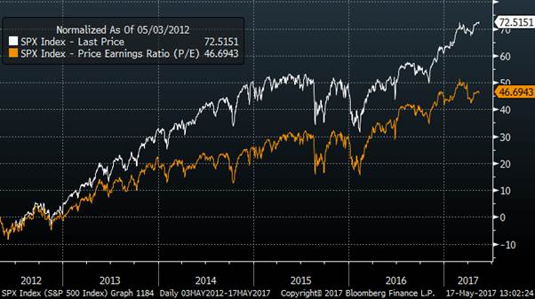
It should be very clear from the normalised chart below that the powerful driver of the equity market performance since 2012 has been an expansion of the PE ratio. The S+P has risen by 72% over that period, and the majority of that is explained by PE ratio which has risen from 14 to over 21, an increase of almost 50%.
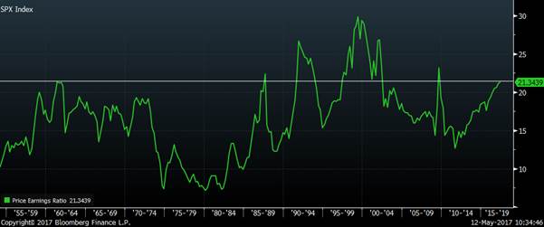
Can PE ratios go higher from here?
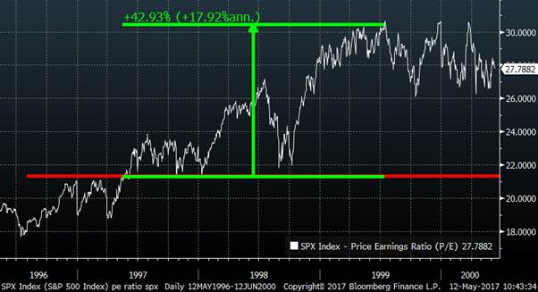
If we look over the long run, it is very rare for the PE ratio to move higher from where we currently are. In fact, it has only happened 3 times; 1991, 1999 and 2009.
In 2 of these 3 examples, high PE ratios were observed during a recession and ensuing bear market with earnings falling even more than prices . For example, in 2009, the high PE ratio was driven by the collapse in earnings not the soaring of equity prices to record highs. These are not helpful precedents for equity bulls right now.
The only previous period where the PE ratio drove the market higher from this level was the dot com bubble. The name given to this period gives a big clue as to what we now think of what happened. If that were to be repeated, then there would be another 40% left in this rally due to PE expansion. This is not impossible but relying on a repeat of the biggest valuation bubble in a century is not reassuring to me.
“Fed Model”
The post I wrote about the Fed model implied that equities represent good value compared with bonds. This generates a counter-argument to my scepticism of a repeat of the dot-com bubble. We have never seen bond yields this low before, so why should we not also see unprecedented low yields in equities (high PE ratio)?
As I explained in my previous post (Framework for valuing equities Part 1- Compared to bonds), I do not think that bonds are good value and so simply beating their performance may not be a high enough benchmark. Most importantly, if QE-driven low yields are pushing up PE ratios, then the termination of QE and rising bond yields should be very harmful for equities.
The other problem is that, even if it is true that holding equities for the next 10 years may work out, the volatility and drawdown you experience may be hard to handle.
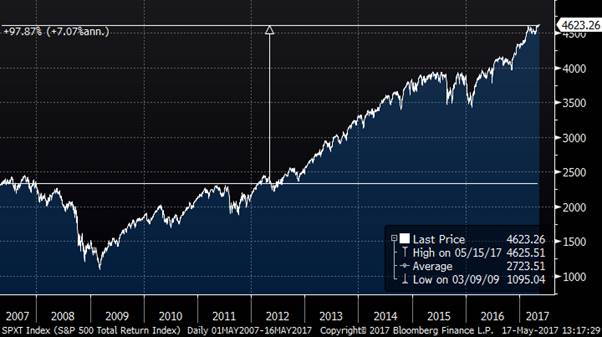
It actually turned out to be 7.1% annualised – which resulted in a total return of almost 100% over 10 years.
That sounds pretty good.
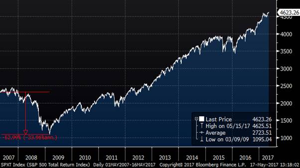
But I bet it would not have felt so good less than 2 years later in March 2009 after a 53% drawdown.
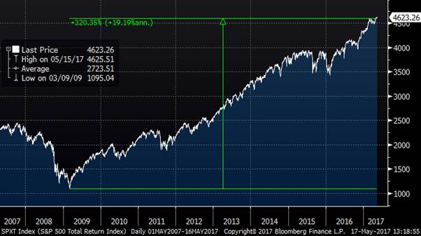
With hindsight waiting for a better moment to enter the long equity trade would have been phenomenally better. If you had waited to buy in March 2009 instead (I know, ludicrous cherry picking, but just about any time around then was great) then your returns would have been a total of over 300%.
Conclusion
The outlook for equities from the perspective of high nominal GDP or high earnings growth look rather limited. Earnings is near record highs as a share of GDP and we are at the stage of the cycle where wages are rising instead.
If we rely on a PE expansion to make us optimistic, we need to be comfortable buying at levels which previously have been associated with a “bubble”.
We can perhaps consider equities being good value compared to bonds, but we must then remember that yields are too low given fundamentals and the termination of QE.
If you are happy to hold them for a decade and do not worry too much about drawdowns, then I come up with an expected annual return of 6.5%. This is higher than bonds right now but perhaps waiting for a better entry level will turn out to be a better strategy.